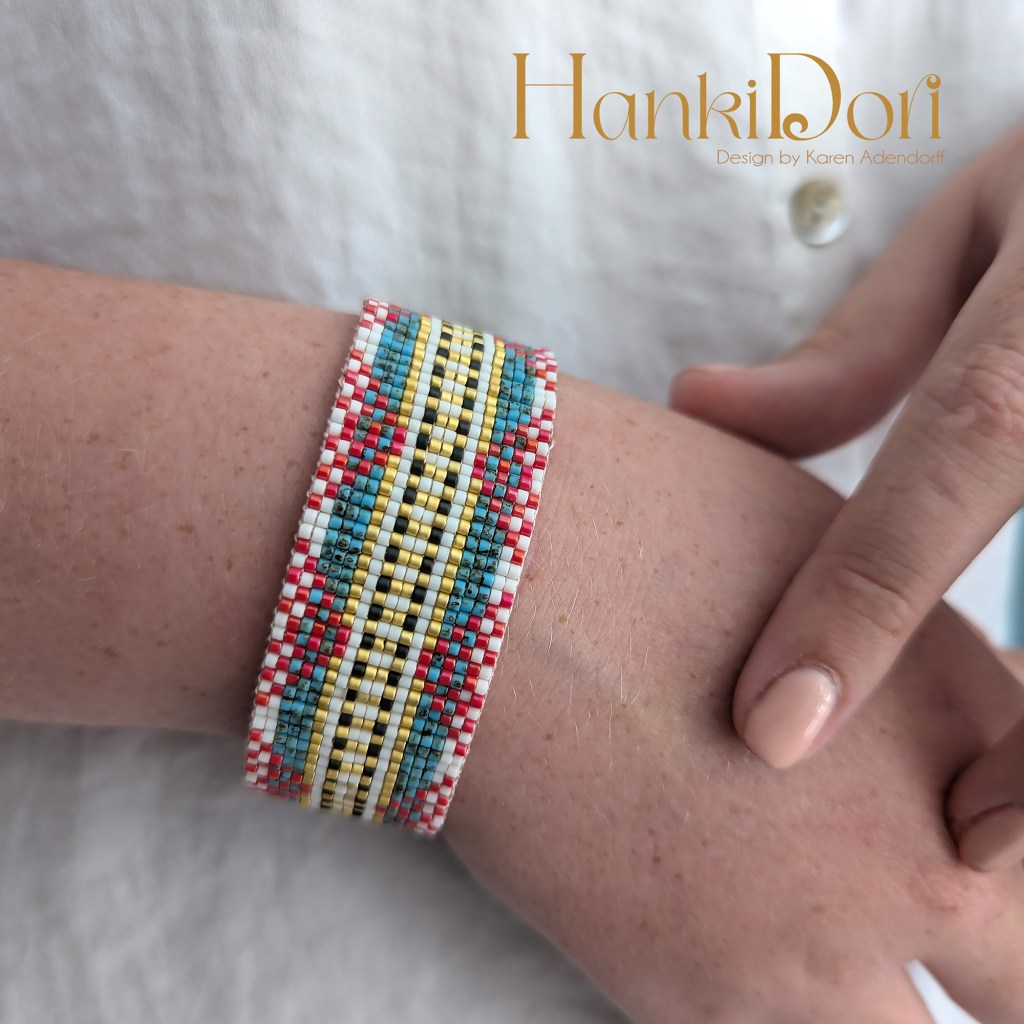
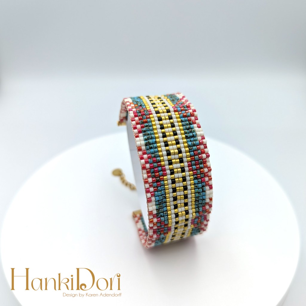
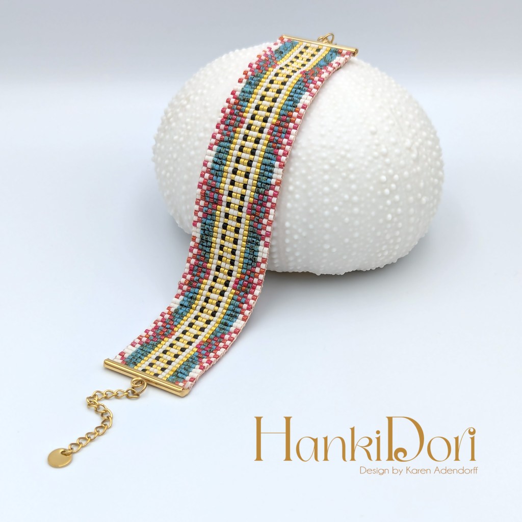
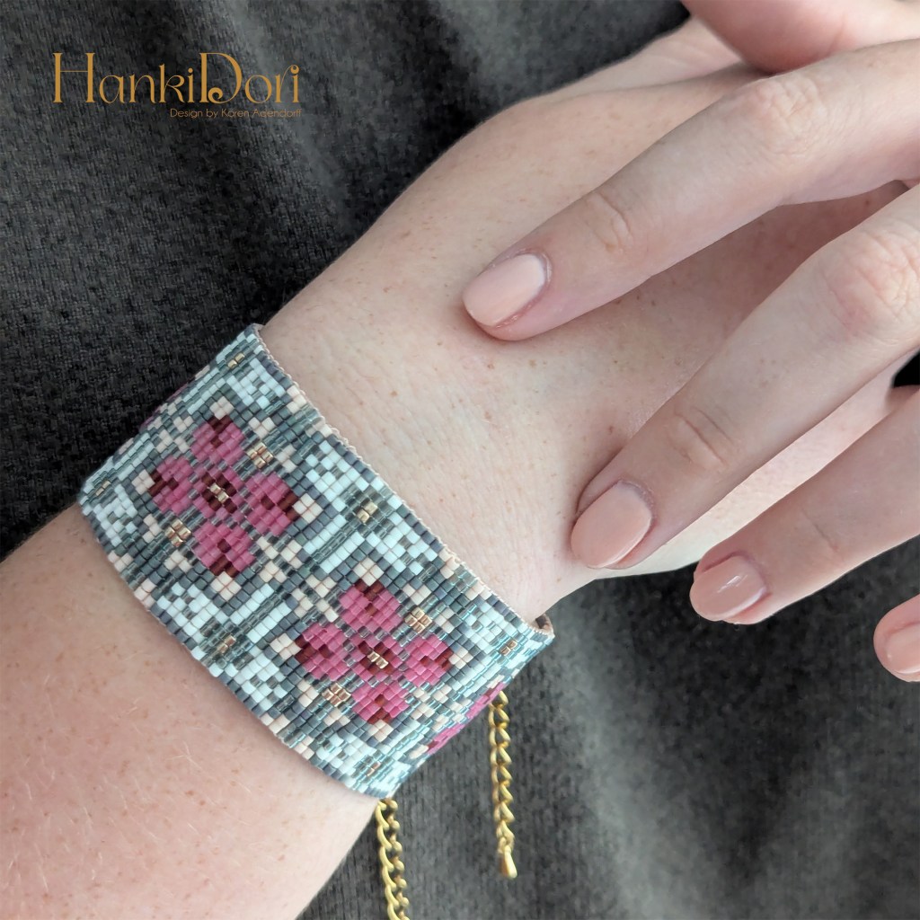
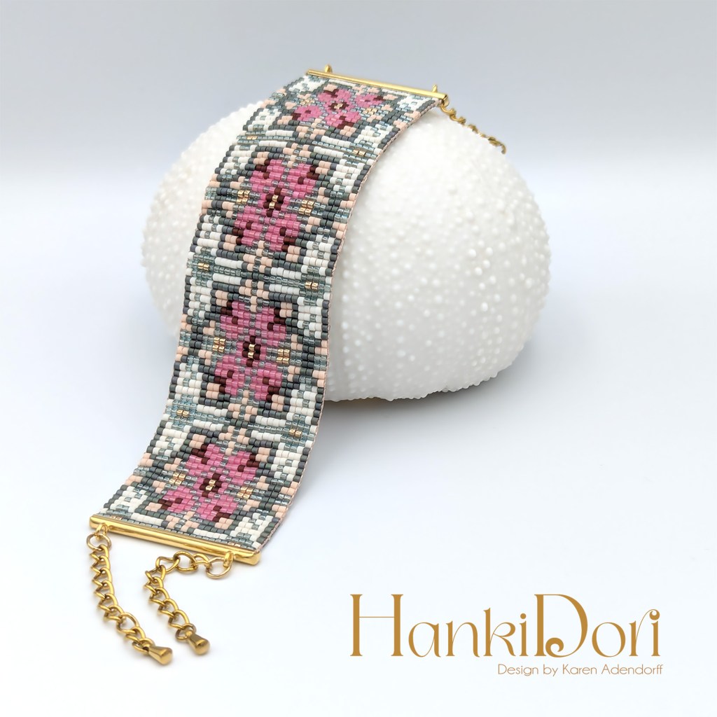
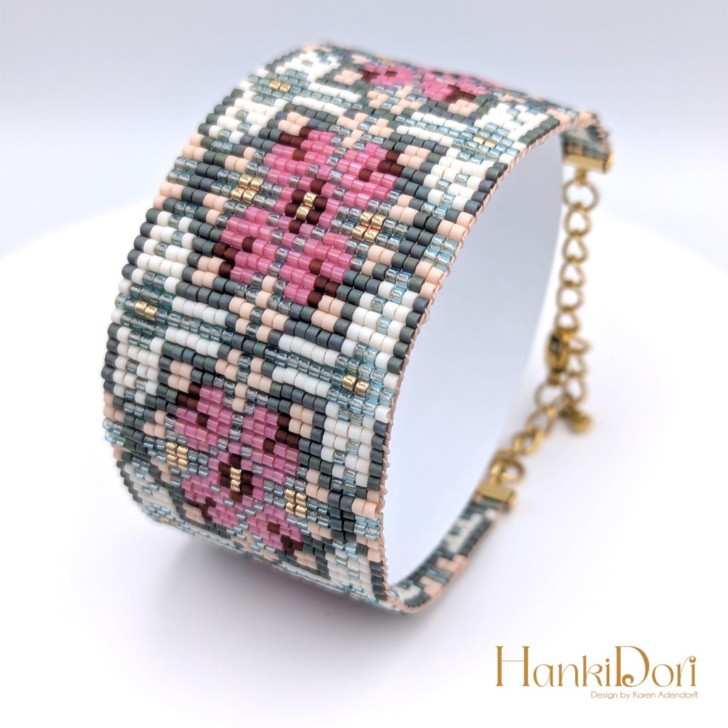
In contrast with my previous bracelet pattern, this is a more modern take on the same original vintage carpet design. Although I have used another part of the same carpet, the use of more primary colors together with the gold make the end design more crispier and cleaner. So if you lean towards more graphic clothing style or print, this one will suit you better than the vintage one of my previous post.
Dimensions: 1 x 5.3 in or 2.5 cm x 13.5 cm Colors: 5 Stitch: Loom Columns: 18 Rows: 78
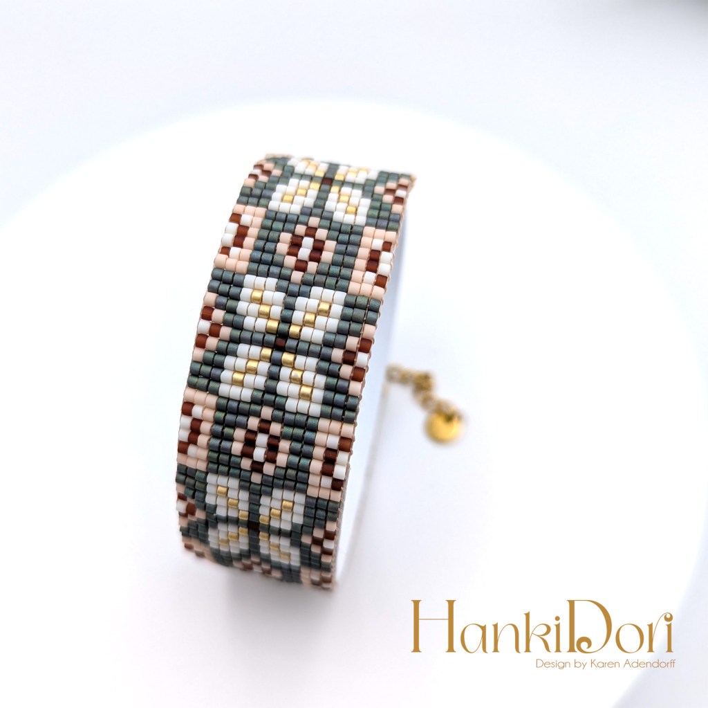
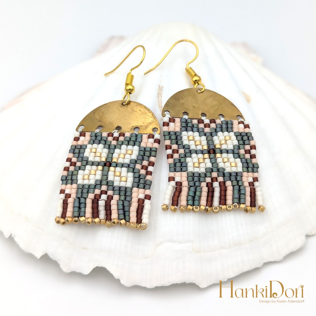
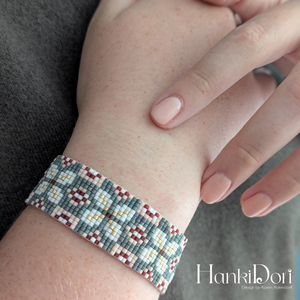
These are my second Beaded Loom Jewelry patterns that are available as PDFs in my Etsy Store. It is a thinner bracelet than the first one and I took my inspiration from old floor tiles. I do have a thing for vintage tiles… In my years as a crochet designer I took most of my inspiration from tile motifs all over the world and it seems to me that the charm of these tiles are still lingering in my art and design. I also felt that a pair of matching earrings will do the trick.
Miyuki Delicas 11/0 Dimensions Bracelet: 0.8 x 5 in or 2 x 12.7 cm Colors: 5 Columns: 15 Rows: 75 Dimensions Earrings: 2.5 x 2.7 cm
About two months ago, I got hooked on beaded jewelry, especially bead weaving. I followed a Domestika course by Marion Mazo and the rest was history. The fact that I can create stylish jewelry in my own small studio without expensive equipment and tools, made me super excited. The ideas keep coming and it is a bit frustrating to make everything in my head with the limited time I have in the evening after work – very addictive. I have completed more than 8 designs, which I will share the coming weeks. But coming from crochet tutor background, I also feel obliged to share the patterns with fellow beaders. Thus the bracelet loom patterns will be available in PDF format in my Etsy shop once I am finished compiling their patterns:
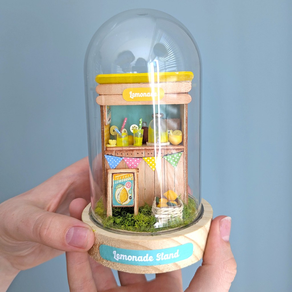
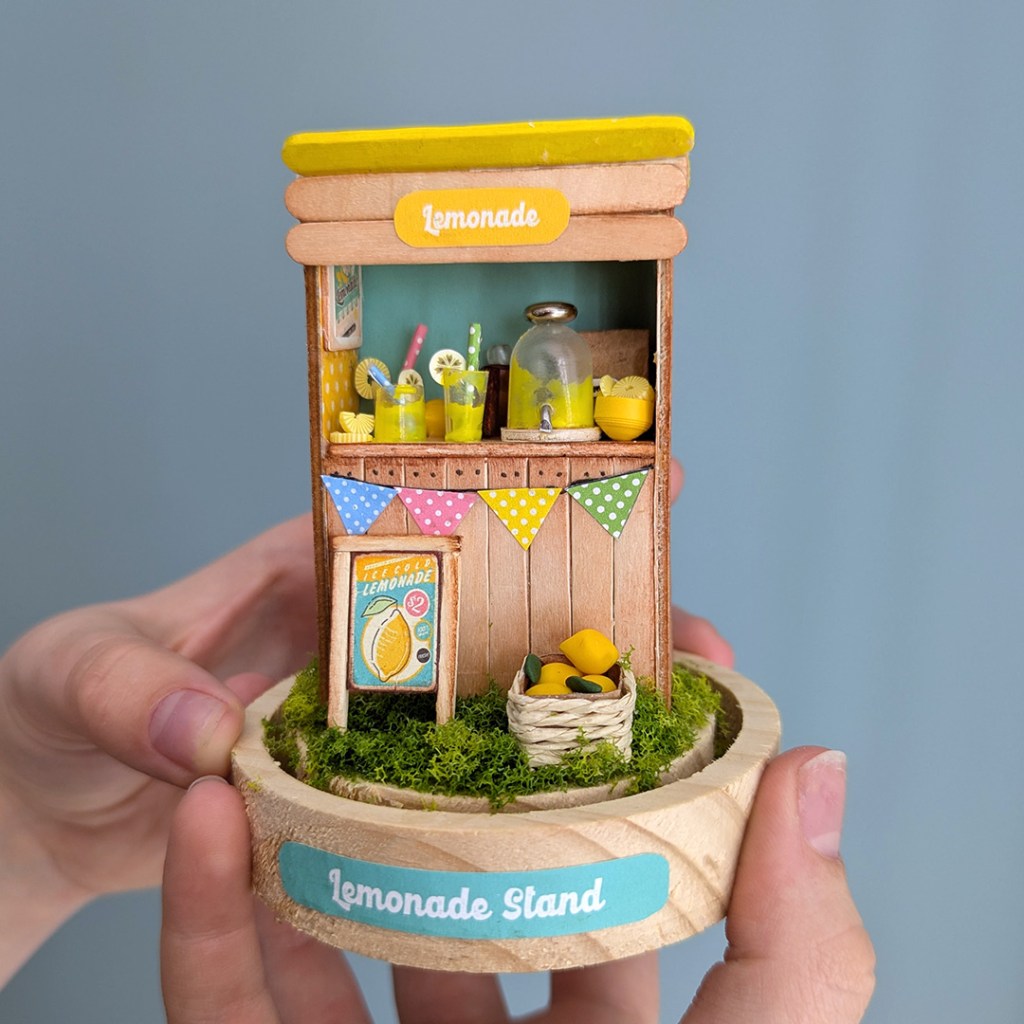
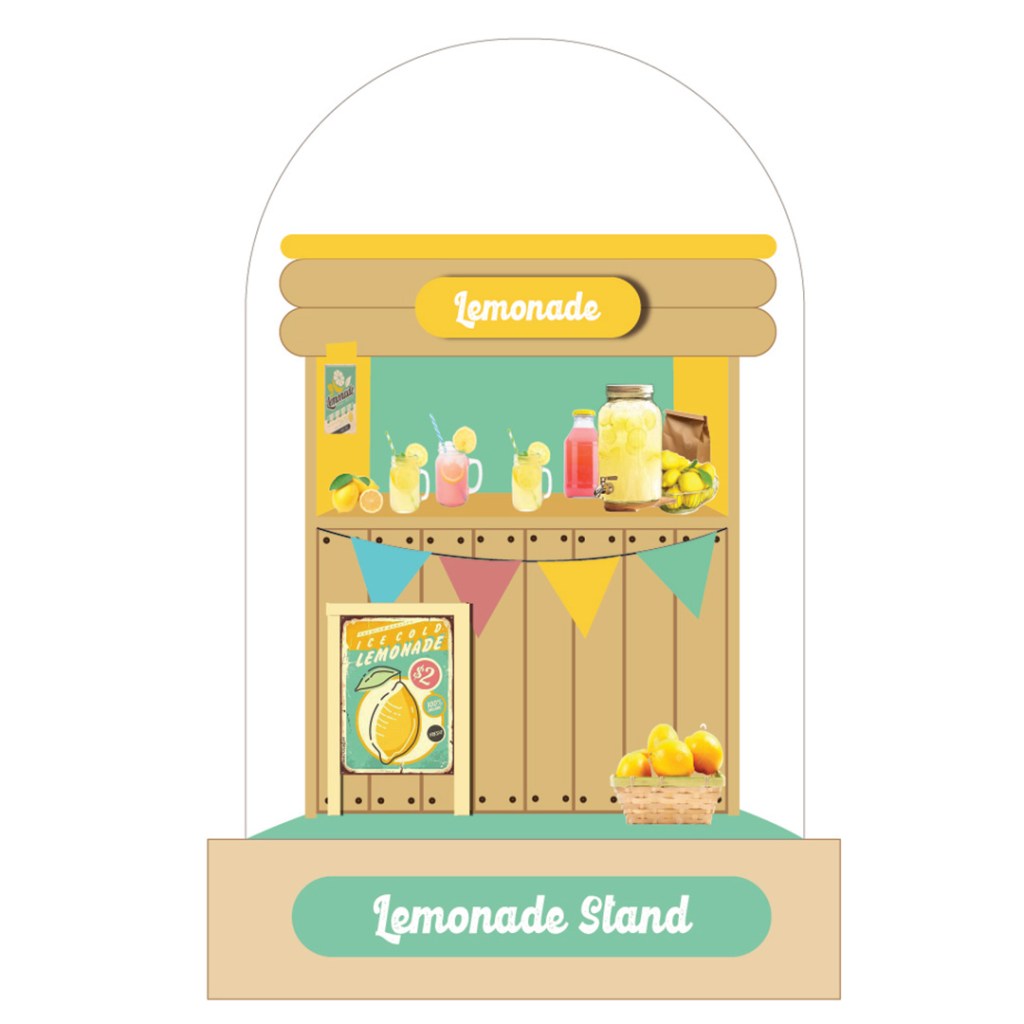
I brought this lovely craft dome from Hobbyflora and challenge myself to an extra miniature build to fit this dome. My inspiration for the color scheme and idea were spring in the air and all the Easter products in store. What is more refreshing dan ice cold lemonade on a hot summer’s day?
If you are wondering how I made the glasses and the lemonade decanter…I have used plastic pipettes, cut into smaller bits and painted with a mixture of yellow acrylic paint and wood glue. The lemons as well as the slices are all polymer clay.
It is always fun to search for the right materials to achieve a certain realistic effect. I loved this one for the fun of it and it was really a perfect weekend craft. And with the dome, the craft is also dust-free.
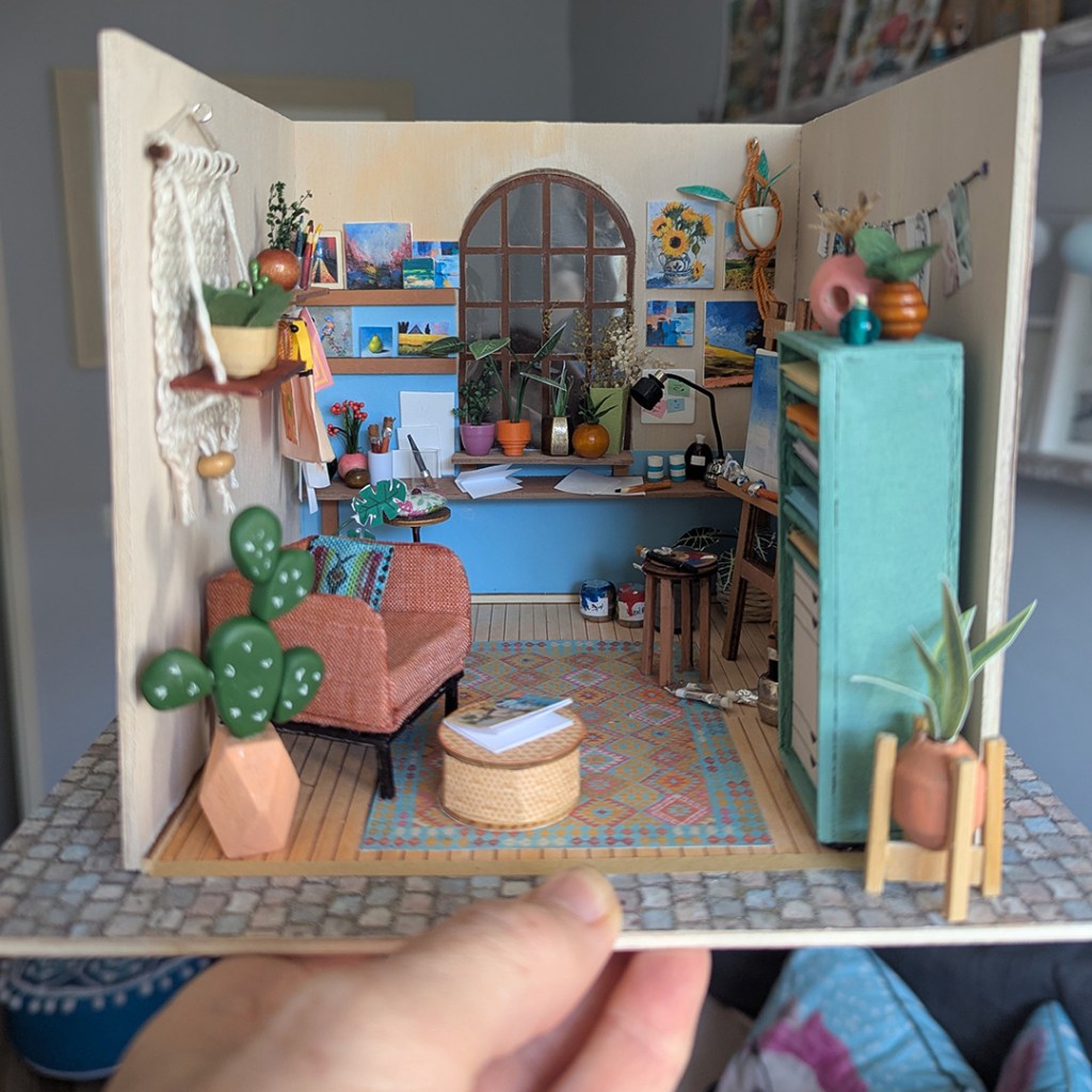
As a professional hobbyist and crafter, you have every excuse to ‘play’ and call it ‘work’ at the same time. I have build quite a lot of miniature houses the last couple of years, but most of them as craft kits. As a creative person, it is not that satisfying to build another person’s idea or concept. I always find myself changing or bettering existing ideas after I have learned the basics of the craft.
I thrive on creative challenges and problem-solving and like to develop instead of follow instructions. As with every hobby I attempt, it ends up in making my own designs. For now I am absolutely hooked on developing miniatures.
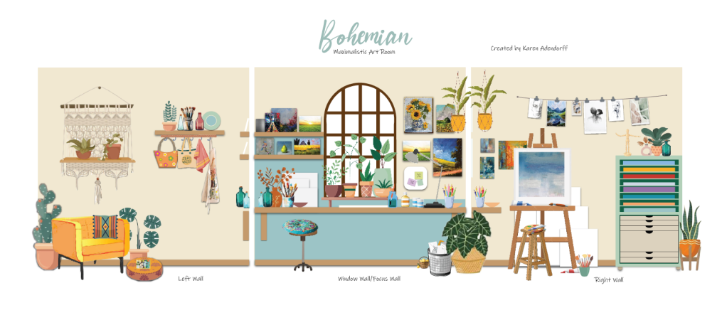
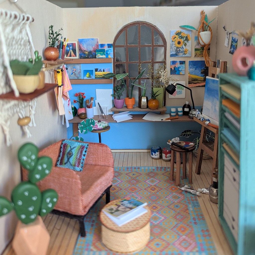
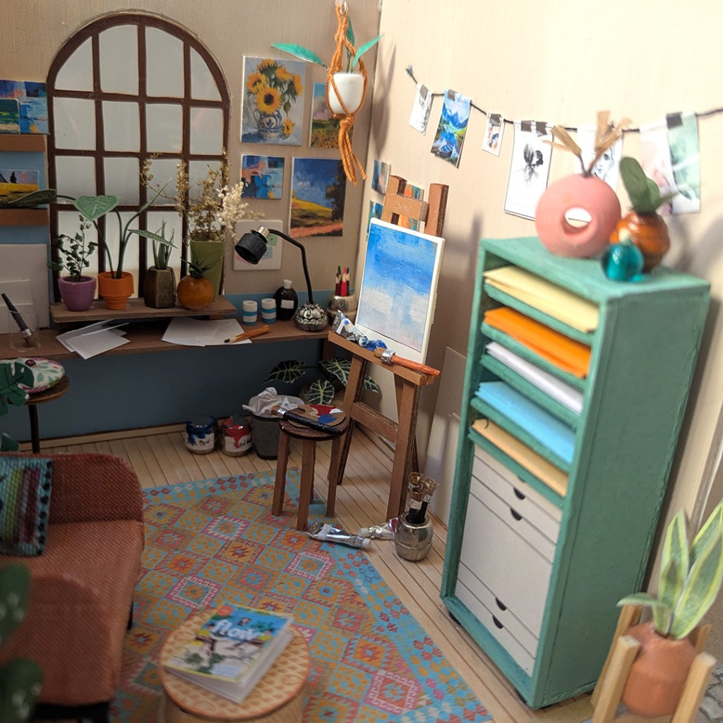
My personal challenge with this Bohemian Art room, was to draw up a visual plan for the room and then to build it as closely as possible with the materials I already had in my studio. The only materials I bought, were wooden board for the walls and furniture and some polymer clay. Some of the materials were leftovers from previous miniature kits. Everything is maybe not as perfect as what I wanted it to be, but I am happy with the result and that I actually achieved my personal goal.
This is how my initial planning looked like. I draw it in Adobe illustrator:
Most of the paintings and the leaves, the carpet, the floors, the bags, cloth, apron, plate, magazine, waste bin and ottoman were designed in illustrator and then printed. Please note that the artwork are images I downloaded from the internet as this project is for personal use and not selling. If I would have sold it, the artwork would have been my own or copyright free.
The left wall:
The cactus was done in polymer and all the other plants were paper prints, which I then cut out and glued on florist wire. I have used beads for most of the pots and those sizes I did not have, I have quilled. The chair is done with cardboard and fabric and the macramé is actually crochet that looks like macramé .
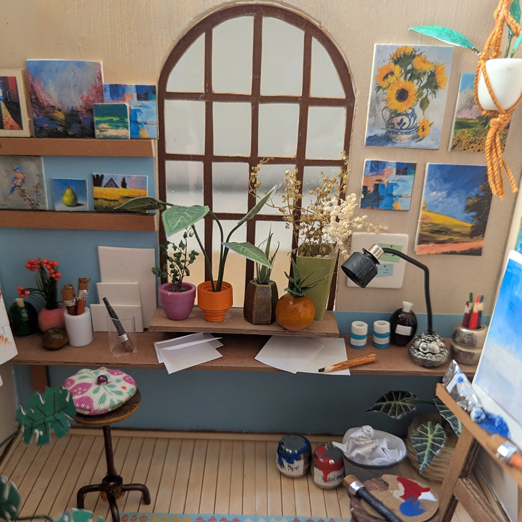
Centre:
The brushes and pencils are made with wooden toothpicks cut shorter and colored by markers. I have used paper and adhesive foil for the brushes as well. The paint cans are silver beads with foil lids and the foil was also used for the paint tubes. The desk lamp is a combination of beads, black wire and paper quilling for the lampshade. You will notice two small blue paint tubs – these are shrink beads glued together.
Right wall:
The cabinet is made of wood panels glued together, but the lower part is a printout glued onto the wood to create the drawer effect.
I hope you like it and I am already busy with the next project in a glass dome!
I would like your comments or suggestions on my project and also if you would like to have tutorials and printables for my future projects.
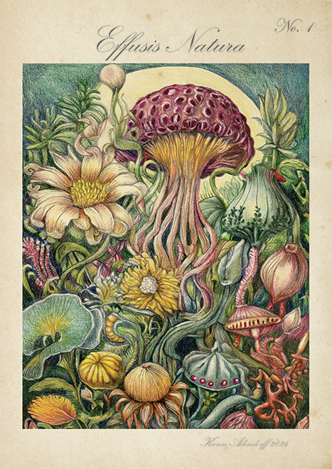
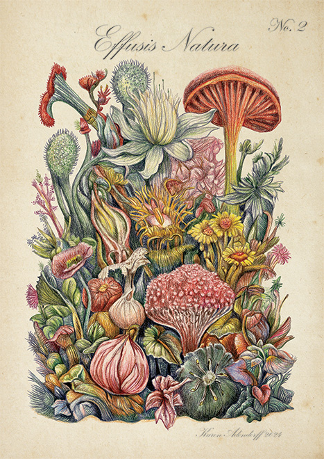
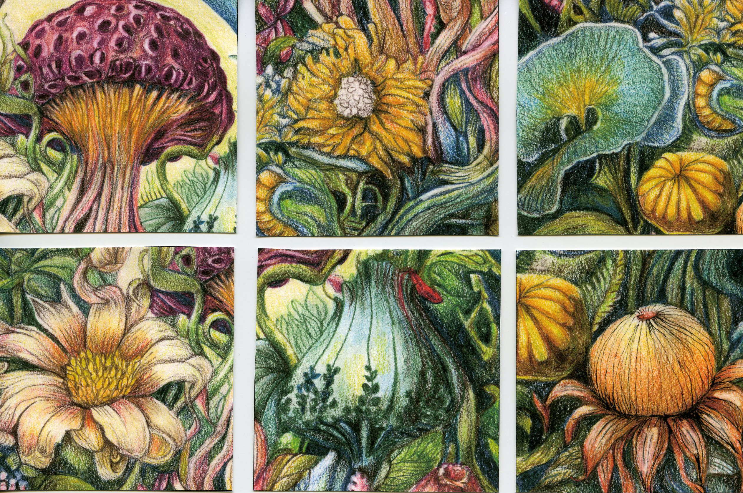
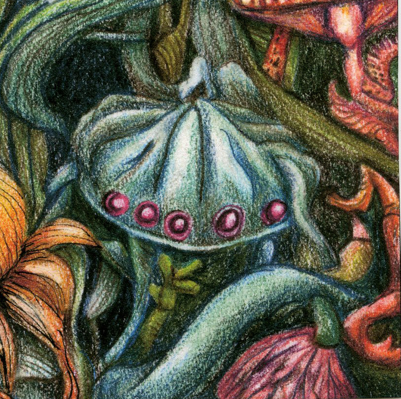
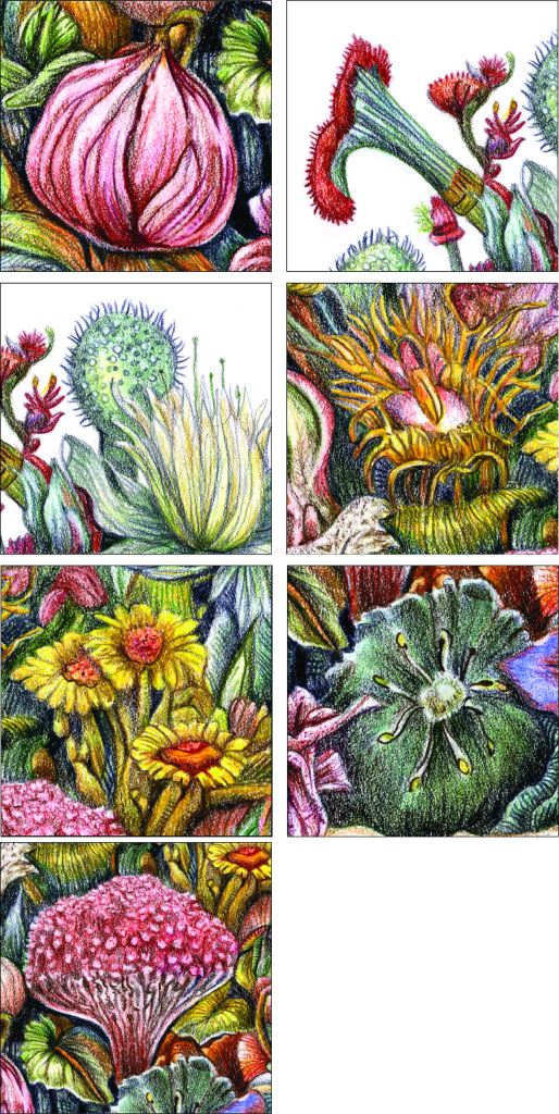
Effusis Natura is my own ‘Latin’name for my flowing nature series of artworks. The series is based on fantasy botanical illustrations with a vintage feel to it. The fist two (Effusis Natura 1 & 2) were done in colored pencil (Faber Castell Polychromos) and then rendered in Photoshop to give it a vintage poster art feeling. These two have a more plant-like and mushroom focus.
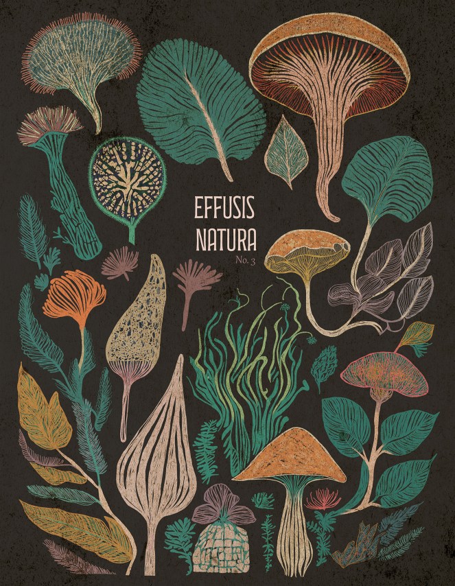
Effusis Natura 3, with its focus mainly on mushrooms, was done totally digitally in Adobe Photoshop with ‘n dark background – almost ideal for a book cover. The drawing style is also more loose and graphical than the first two illustrations.
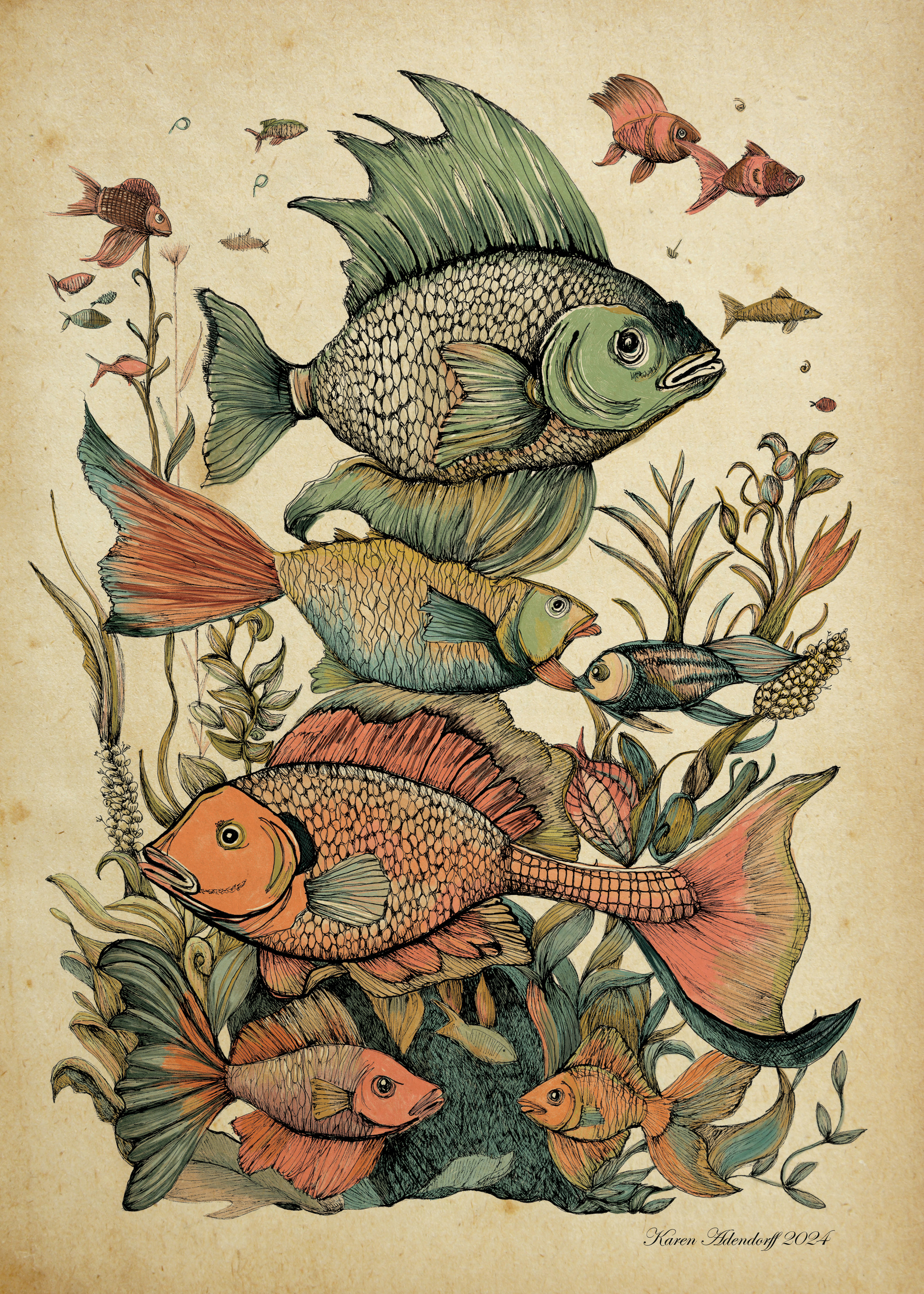
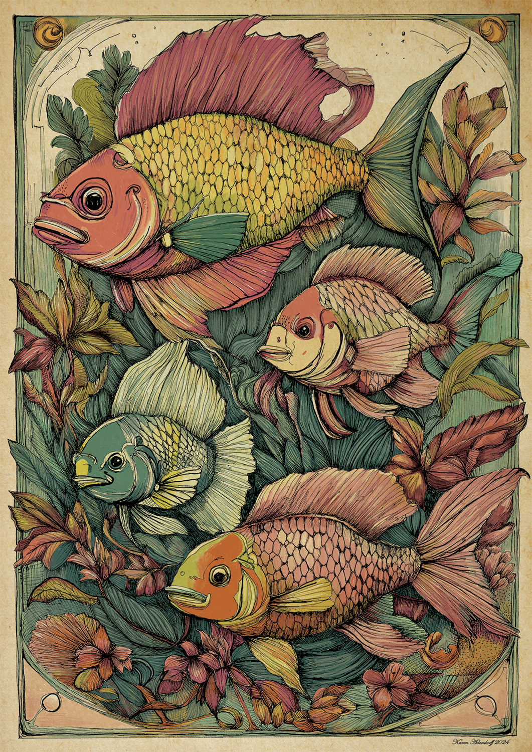
Effusis 4 & 5 have a fish theme, also fantasy with a vintage poster look. These were drawn by hand and then inked, using Unipin fineliners. After inking, it was coloured and rendered digitally in Photoshop.
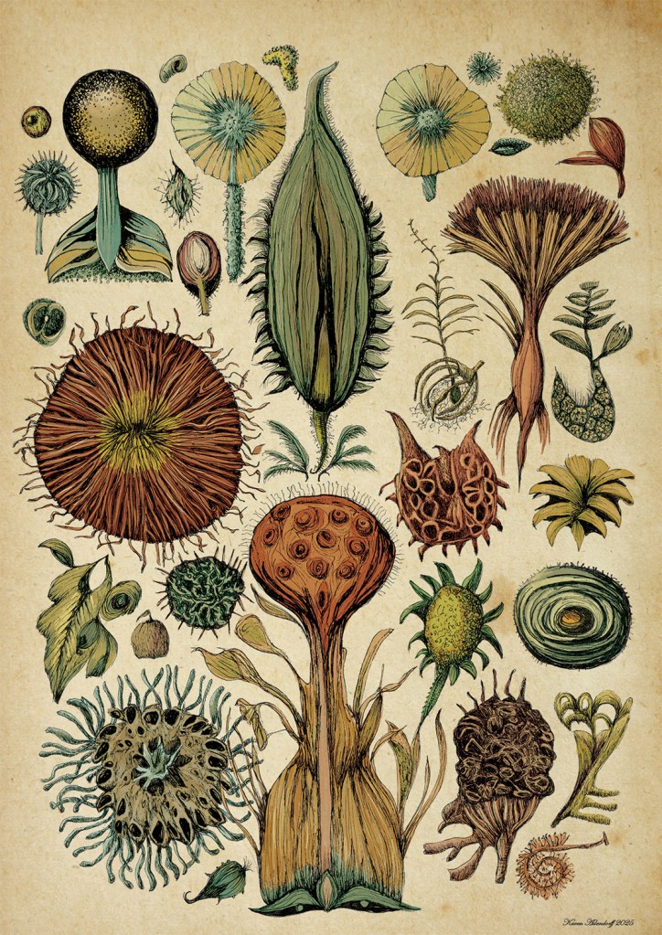
Effusis 6 was done in the same way as the fishes, but the focus on strange seeds and seedpods. Effusis 7 is still in the making and will be posted after completion.
Life brings you special people, little pleasures and lots of ideas to chew on. This is basically the description of my Christmas holiday when meeting up with a friend I last saw 33 years ago. We both went to the same school and lived in the same small town and subconsciously shared the same ideas and despised the same people, but back then were more or less trying to survive the inevitable peer pressure current.
It was a bit funny and ironic to meet in Europe after all these years, as we have never visited each other in South Africa. We did write each other letters though, which includes family photos and fabric samples. When she contacted me, I was a bit nervous , but at the same time very excited. Will we have a lot to talk about or will we be total strangers?
It turned out to one of the best moments in my life. One day was too short to recap all the missing years. It was actually a blessing to meet someone trapped in a world that look at your date of birth and write you off as compost, someone who still feels the energy to make a difference, someone who wanted to unlock their creativity – you know its there, but it was so deeply buried under years of family priorities, someone who looks at the world as if it is pretty, someone with a contagious laugh…
So we met again during her stay in The Netherlands and decided to commit ourselves to a year’s project that will encourage us to be creative again and to stimulate our senses with new ideas.
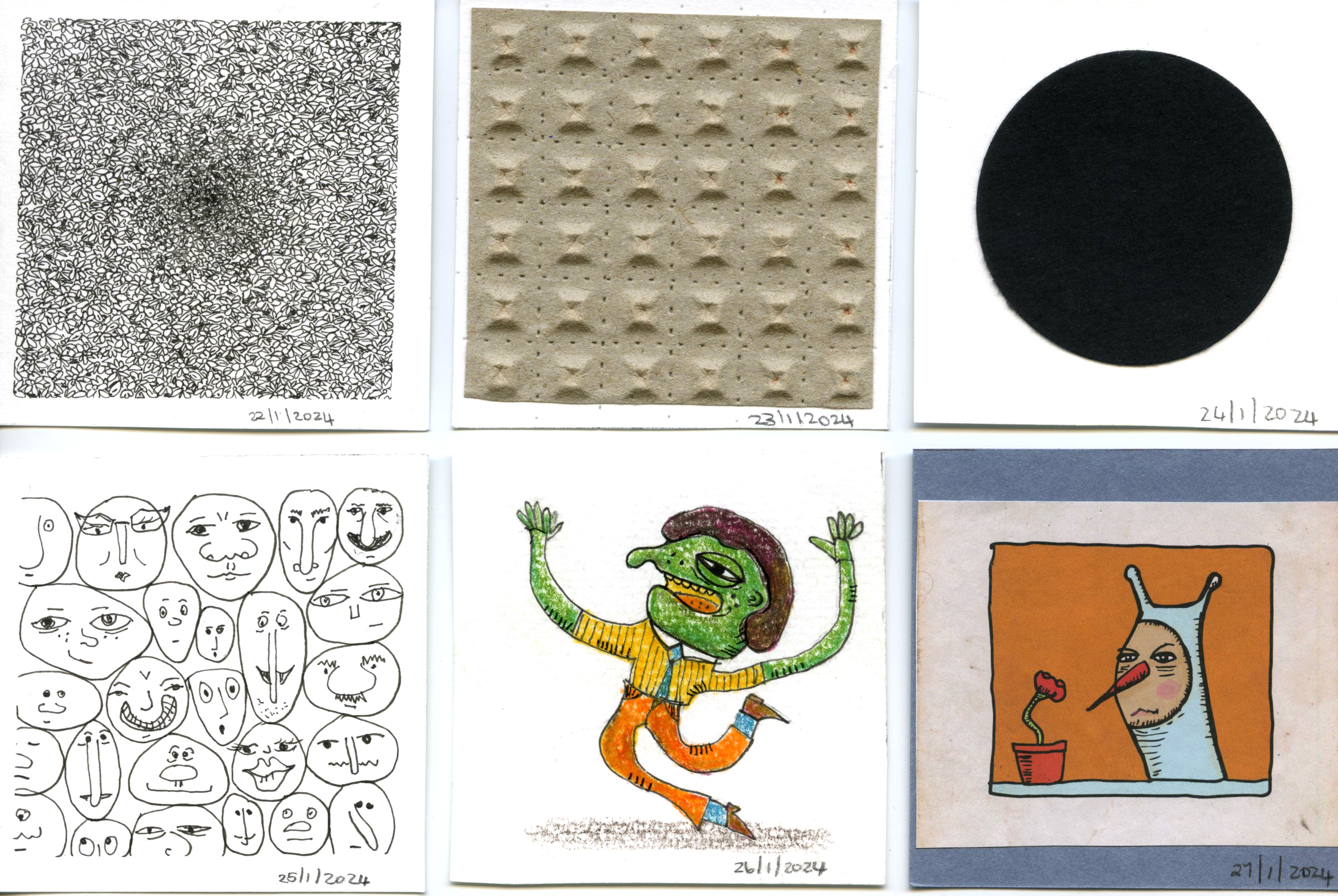
The project was to make an artwork on a 7 x 7 cm square each day for a year long. This was a great idea because for a week I could not sleep.. my head was bursting with possibilities…of subjects and of media…
I have decided to share the artworks each week and by the end of the year, have a massive collage to reflect on and hopefully smile upon.
Week 1:
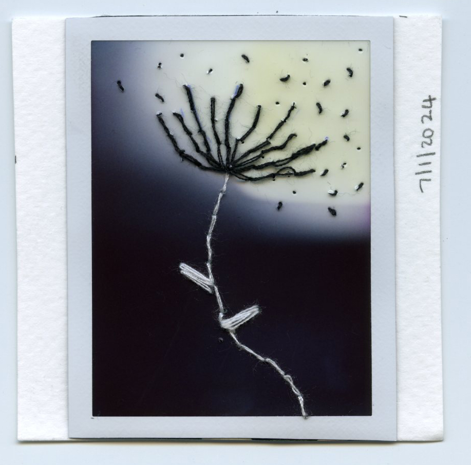
January 1: I made myself a black dress; January 2: etch – my work life in a seed company; January 3: I drank a whole bottle of ginger juice, which was supposed to be mixed in small quantities in other juice; January 4: the pavement patterns of Haarlem; January 5: my daughter needs new glasses; January 6: the color I painted one of my living room’s walls, January 7: old Polaroid film that got light brings new possibilities.
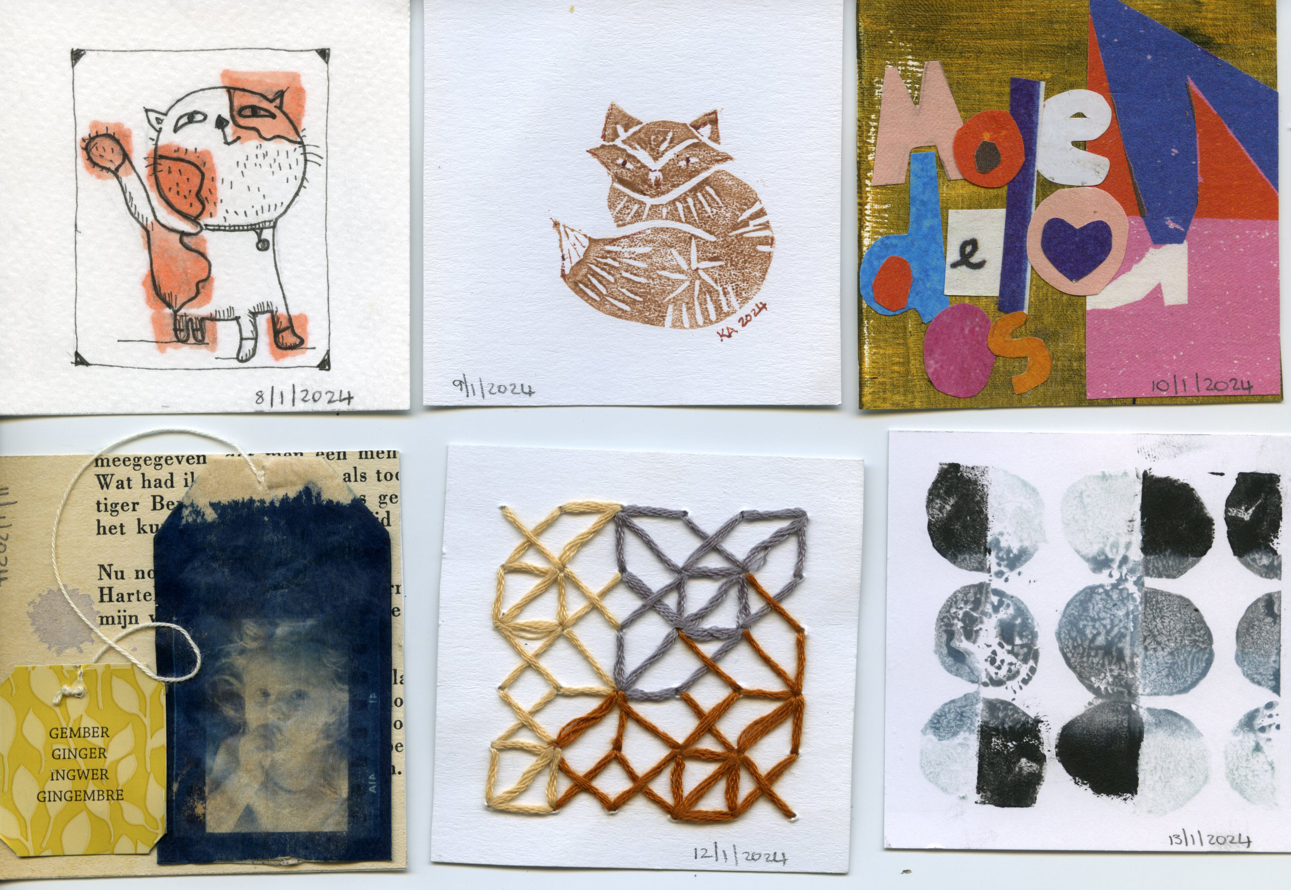
Week 2:
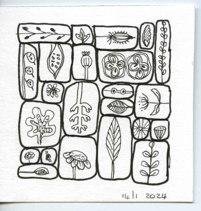
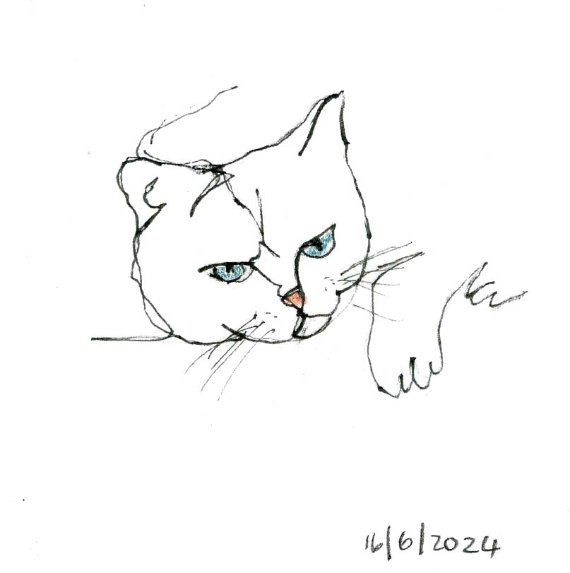
January 8: Cat love; January 9: fox rubber stamp print; January 10: Collage of the Afrikaans word: ‘Moedeloos’ – despondent – a bit of a down day; January 11: cyanotype of a film negative on tea bag; January 12: string doodles; January 13: half circle stamping, January 14: Plants and seeds.
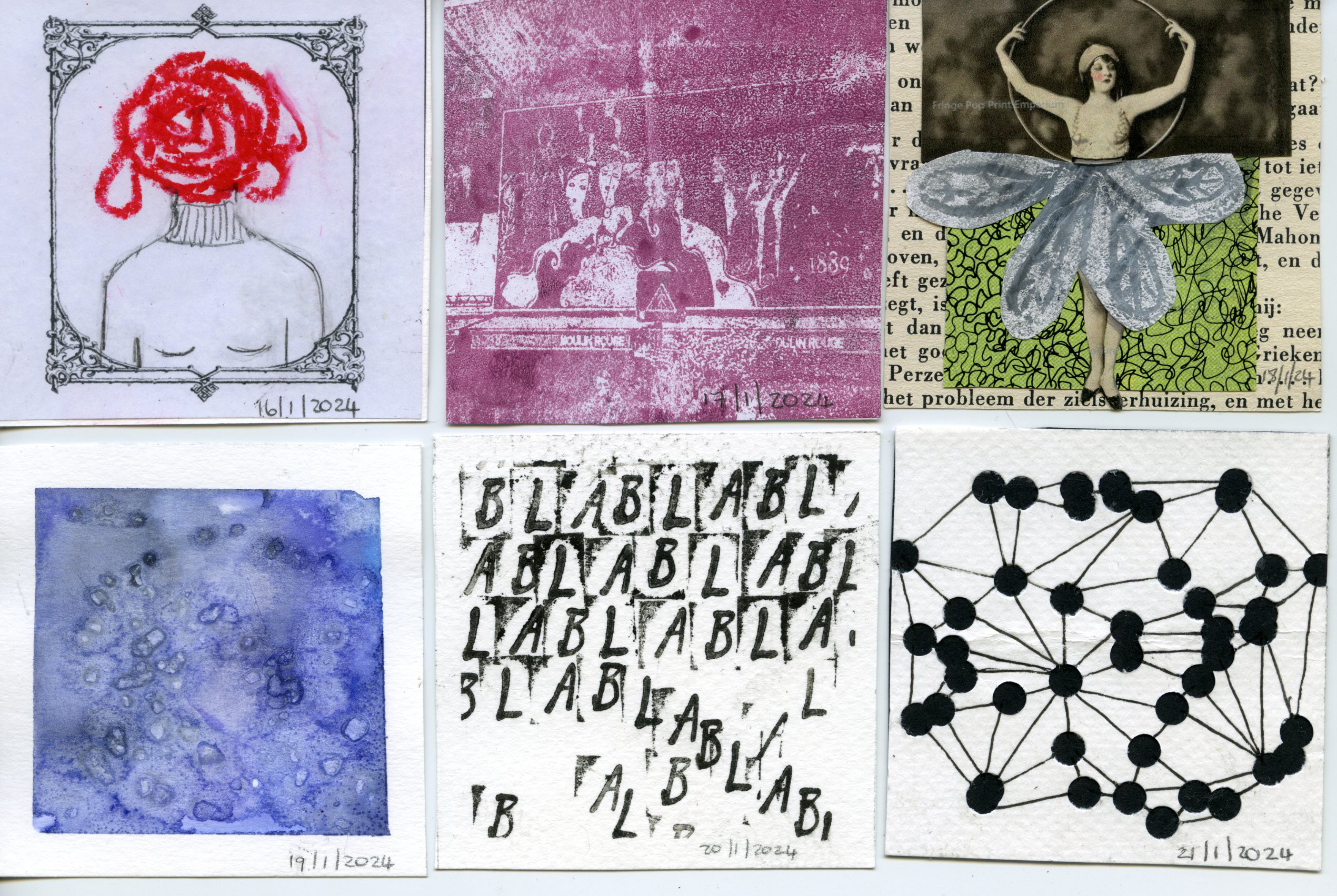
Week 3:
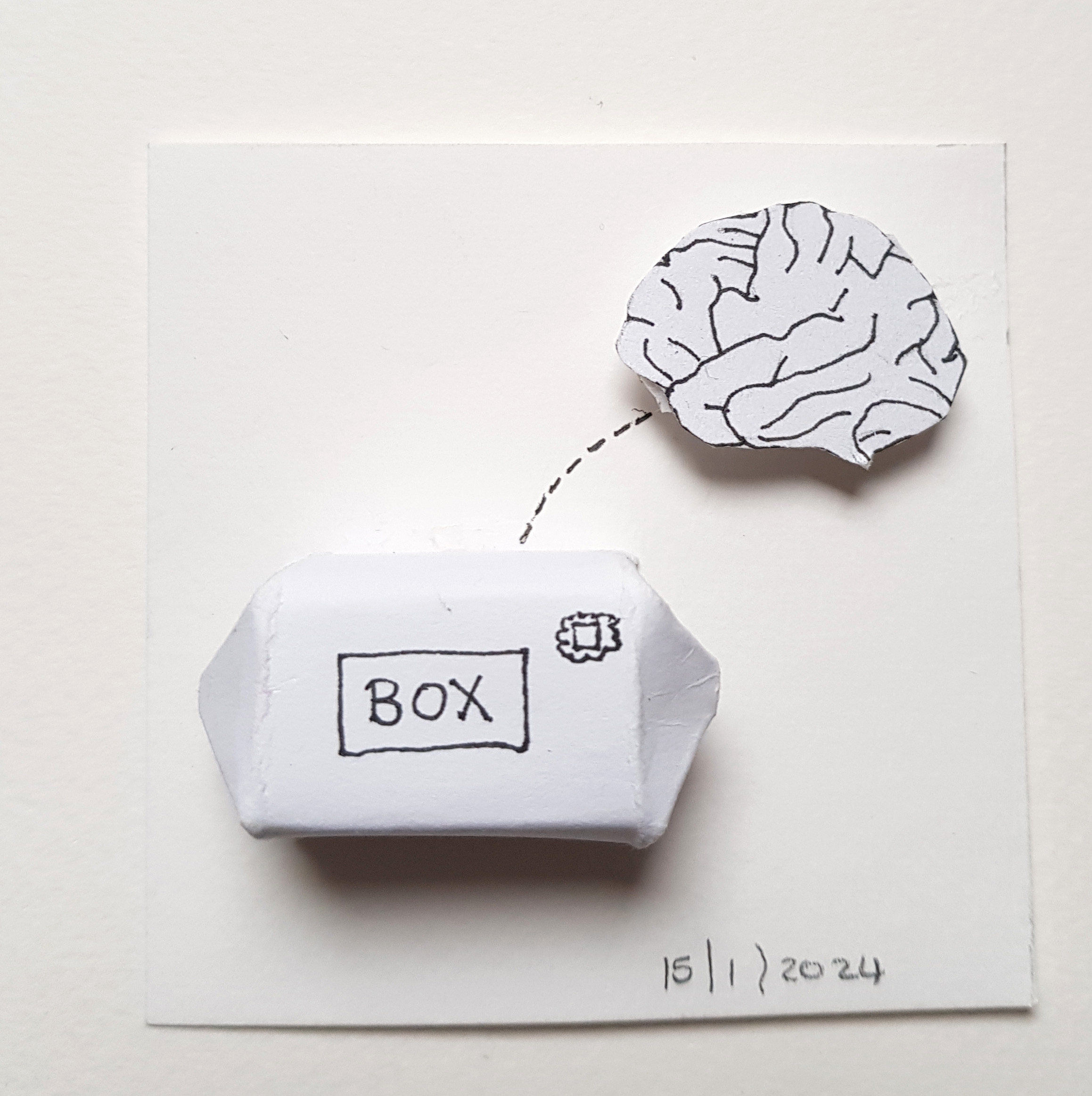
January 15: thinking outside the box; January 16: muggle head; January 17: gel print of a part of Moulin Rouge; January 18: circus fairy (me in my family); January 19: ice and snow; January 20: when there is not much to say; January 21: my inner atoms.
Week 4:
January 22: to escape repetition; January 23: not to escape repetition; January 24: sad and empty; January 25: Exercise 1 with Alberto Montt; January 26: Exercise 2 with Alberto Montt; January 27: Exercise 3 with Alberto Montt; Exercise 28: Rest.
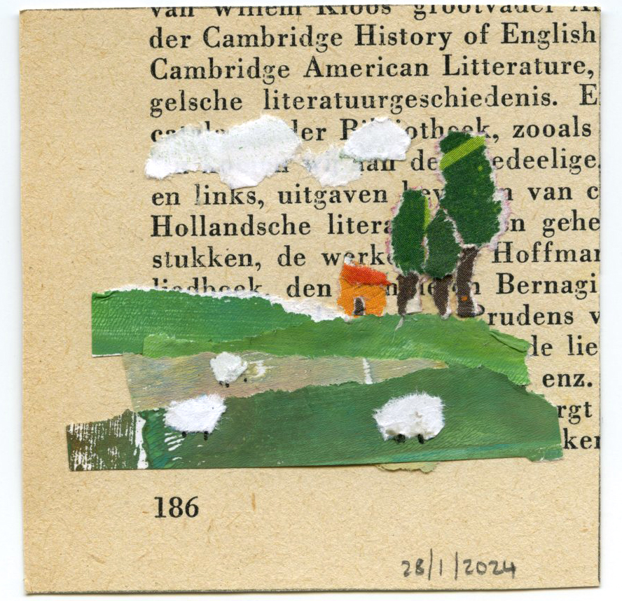
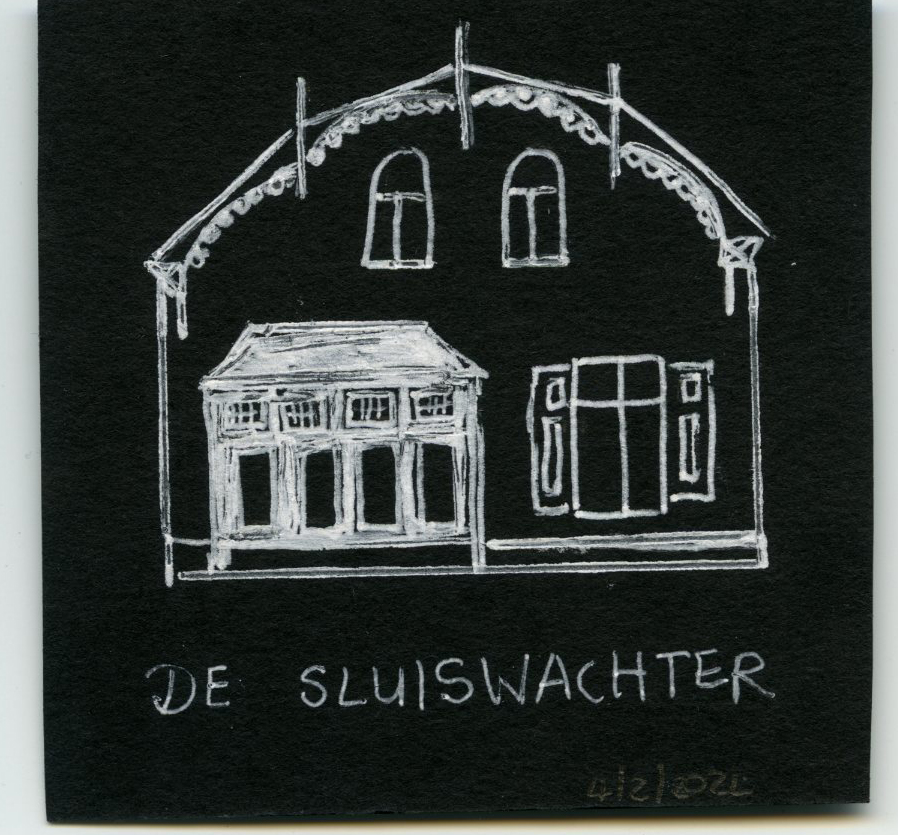
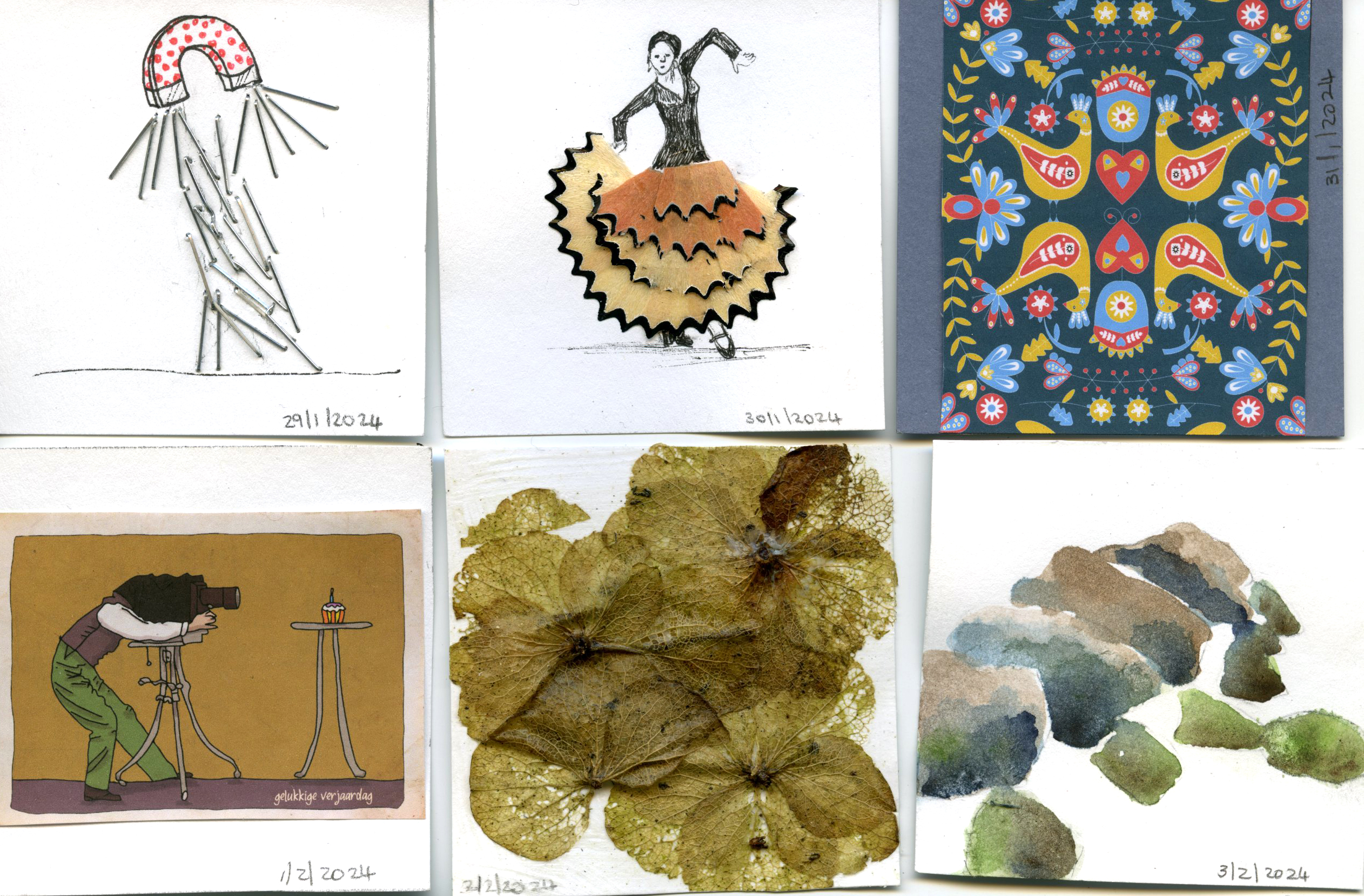
Week 5:
January 29: magnetism towards new ideas; January 30: dancing with my pencil; January 31: new design for my mousepad – came out beautifully; February 1: hubby’s birthday; February 2: into the woods in Drenthe for weekend; February 3: prehistoric hunnebedden; February 4: De Sluiswachter (Dieverbrug) in memory of last night’s 3 course meal which was out of this world.
Week 6:
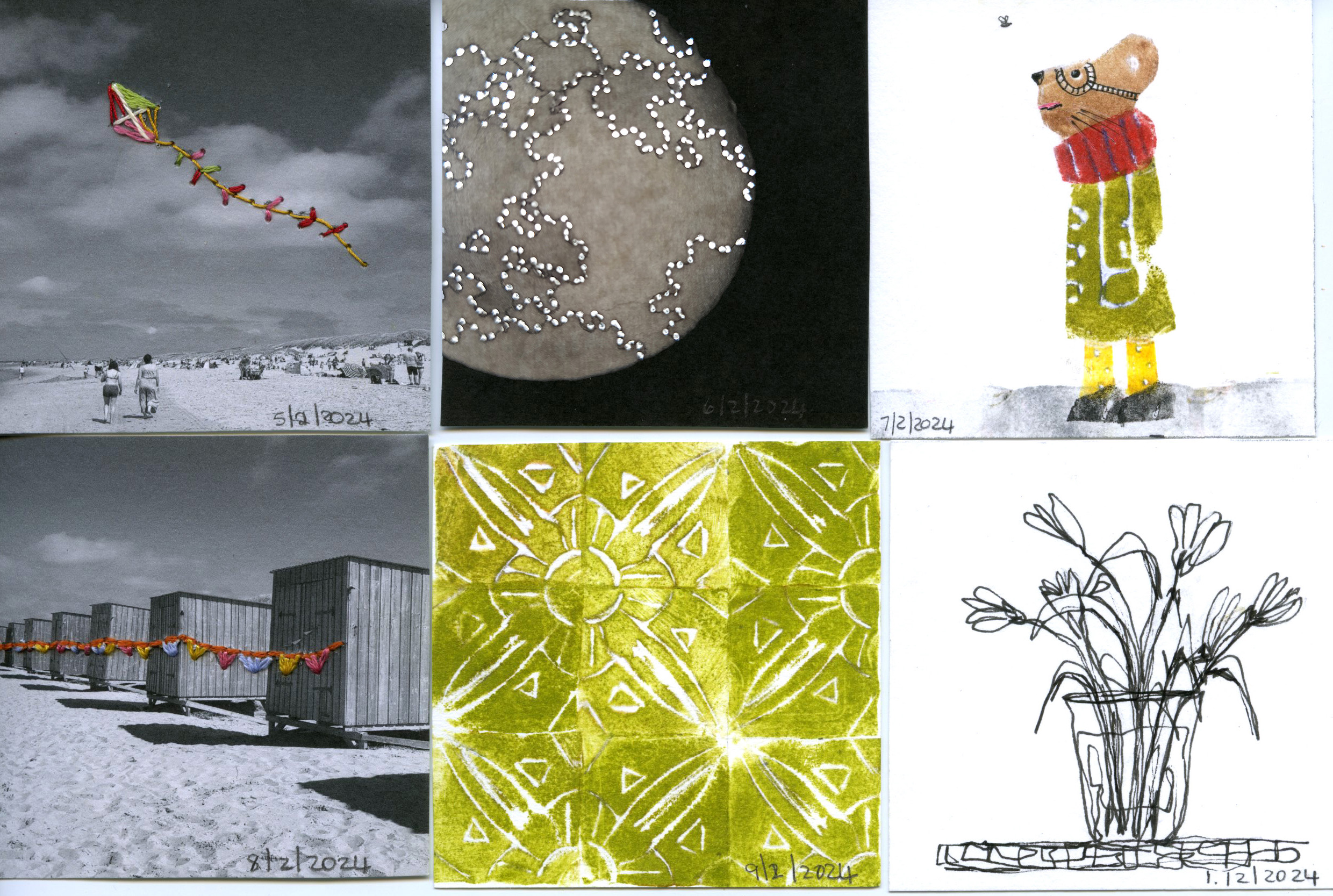
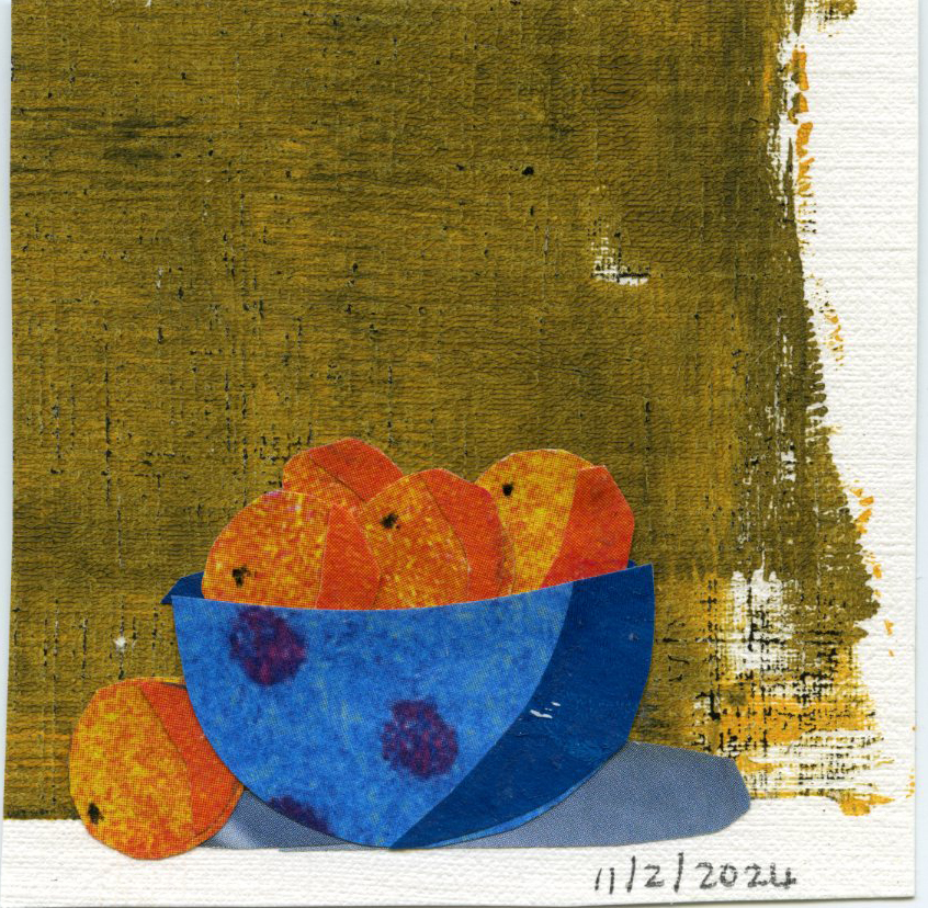
February 5: Longing for Summer 1; February 6: mysterious life on the moon (piercing on photo with back light); February 7: Foam Stencil story; February 8: Longing for Summer 2; February 9: Foam stencil tiles; February 10: White tulips; February 11: Collage still life.
Week 7:
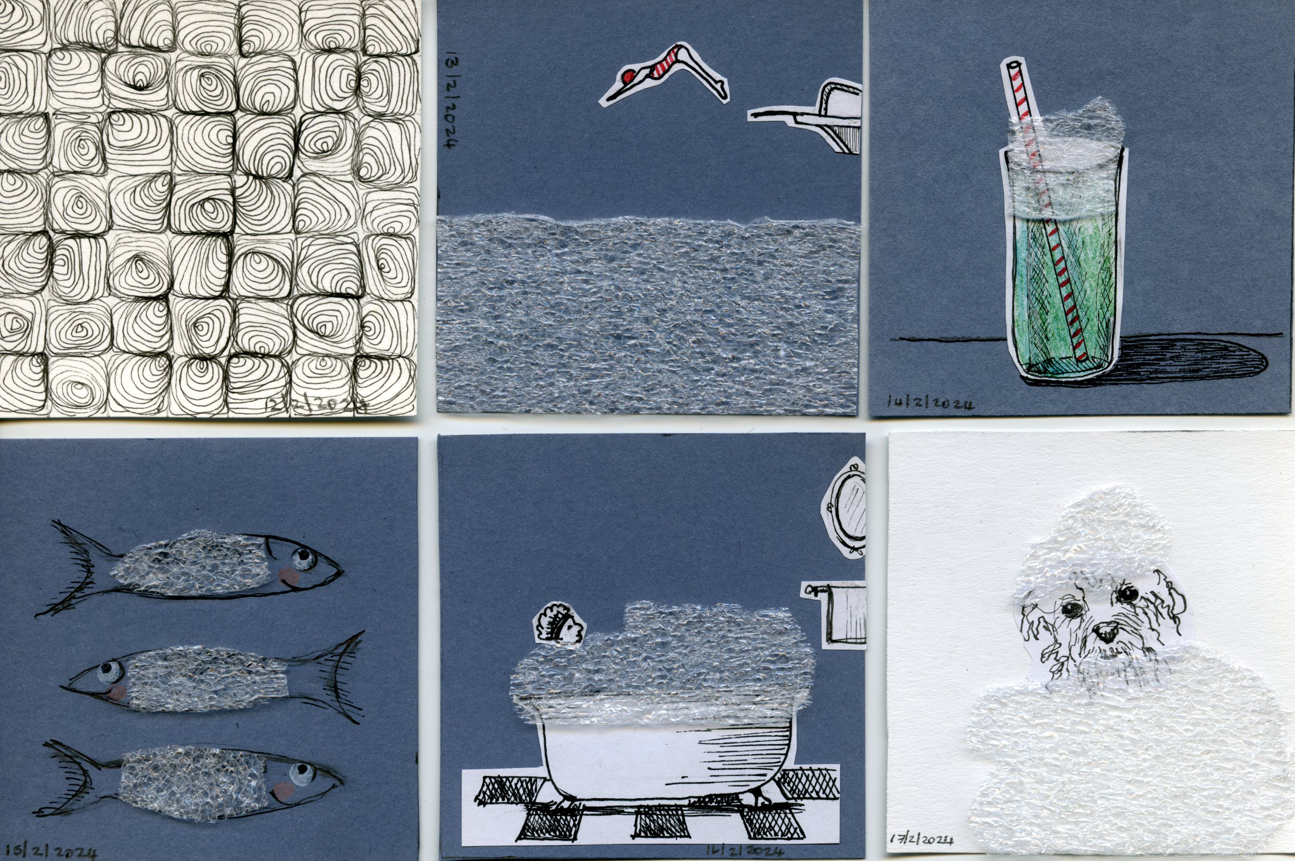
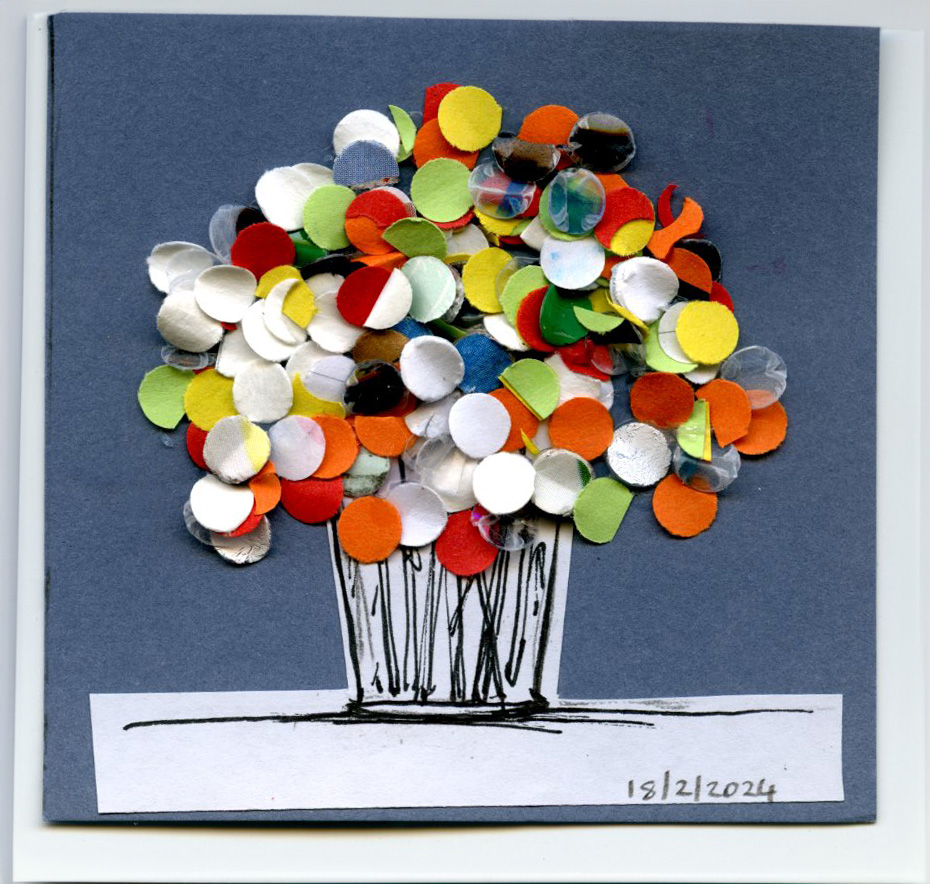
February 12: Cubic doodles; February 13: Dive (with packaging plastic); February 14: Float (with small piece of packaging plastic); February 15: Fishy (also with pieces of packaging plastic); February 16: Foam bath; February 17: Dog wash, February 18: Color
Week 8:
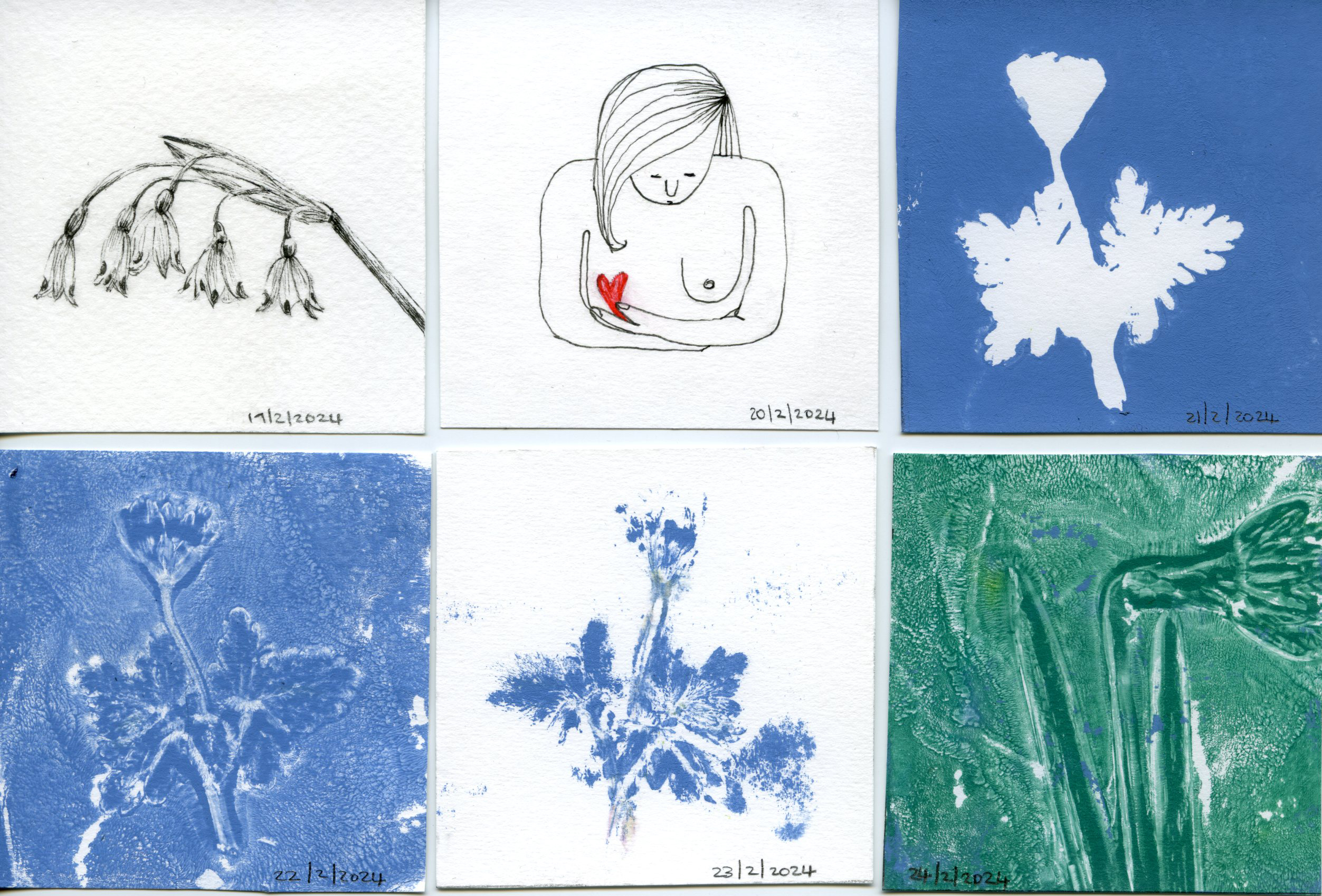
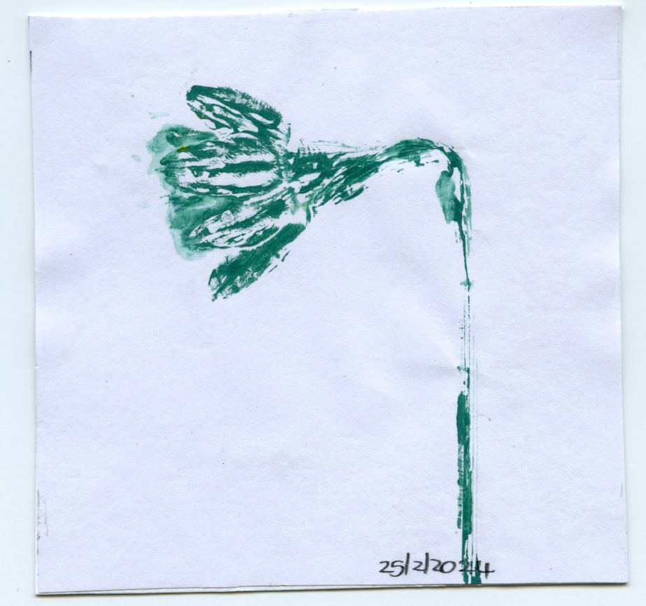
February 19: Lenteklokjes; February 20: a friend going through an operation; February 21-23: Gelli print of spring bulb in different ways, February 24-25: Gelli print of daffodil in two ways.
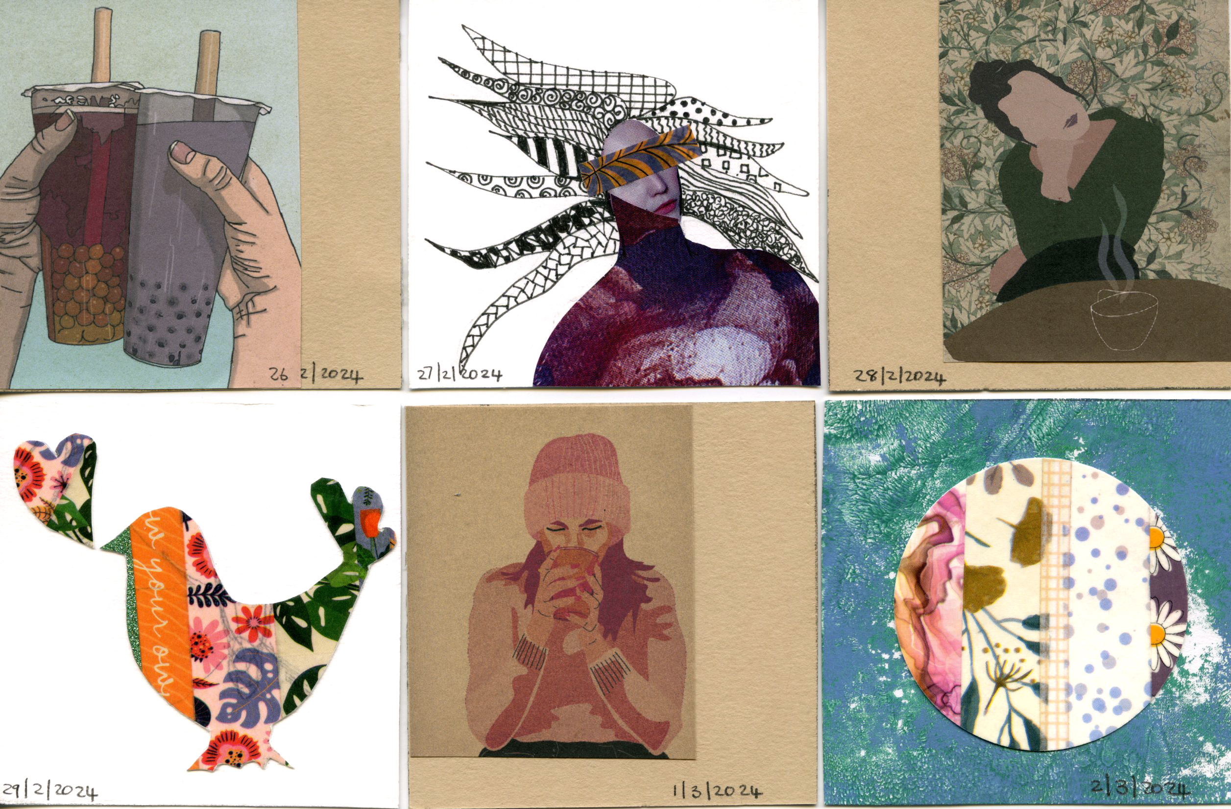
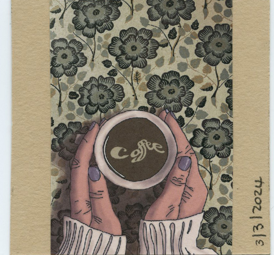
Week 9: February 26: Boba times: working on digital portfolio; February 27: Experimental madness; February 28: Coffee digital image 1; February 29: my heart went out to friend; March 1: Coffee digital image 2; March 2: Sunny day; March 3: Coffee digital image 3.
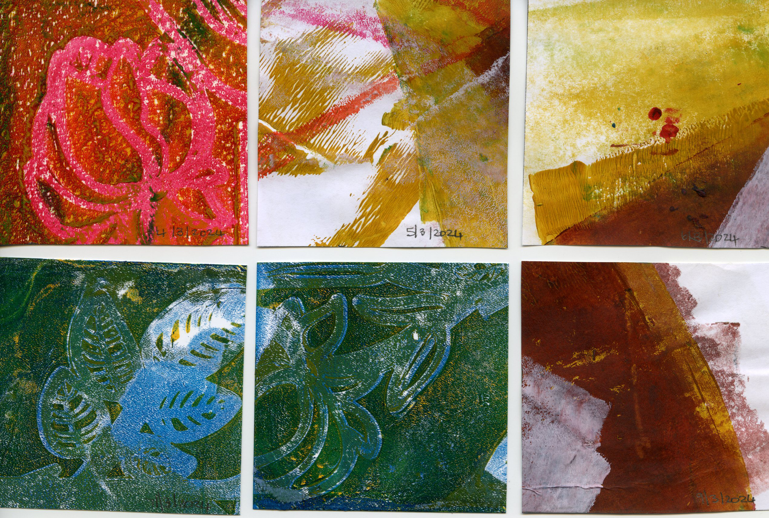
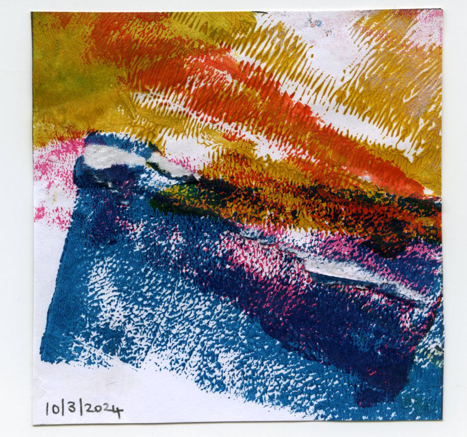
Week 10: 4-10 March: Texture impressions done with Gelli plate to use as backdrops for my digital art.
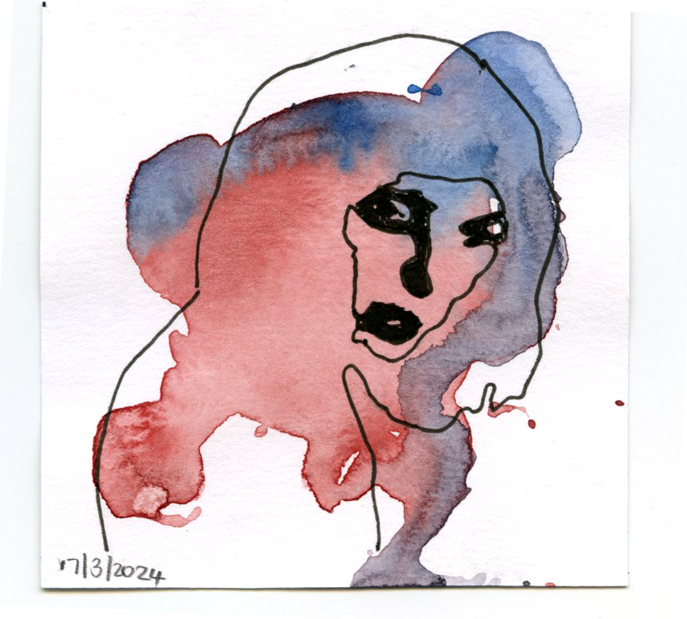
Week 11: 11-17 March: Series of the same portraits done in different media like fineliners, pencil, watercolour, markers and paper collages.
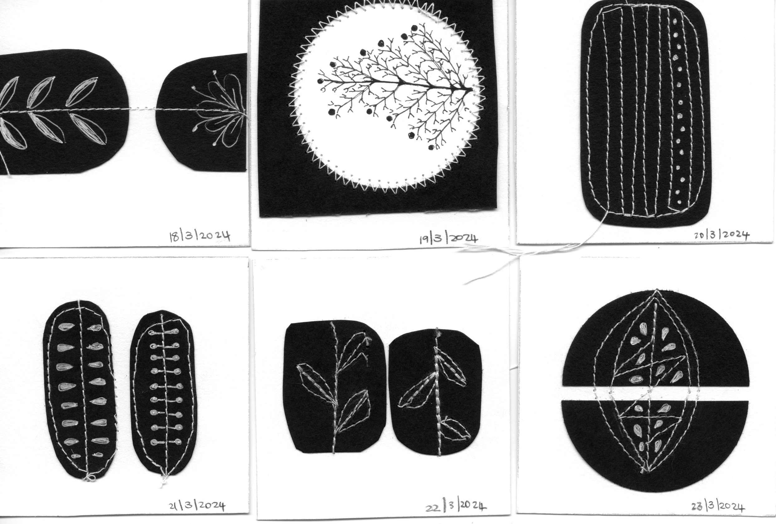
Week 12: 18-24 March: Black and white impressions
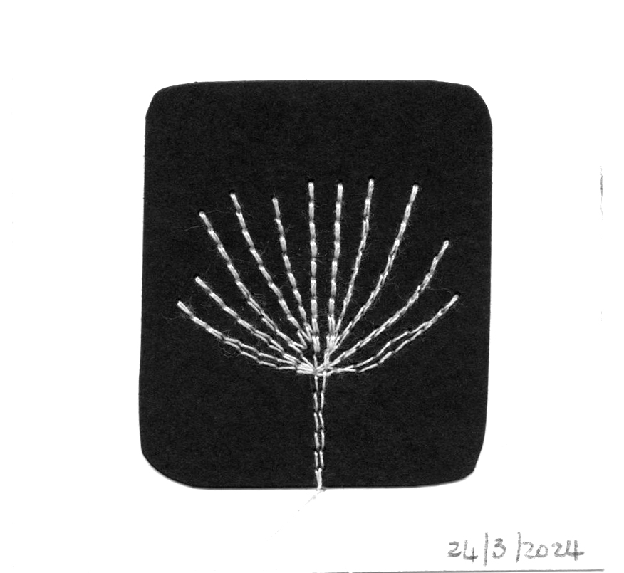
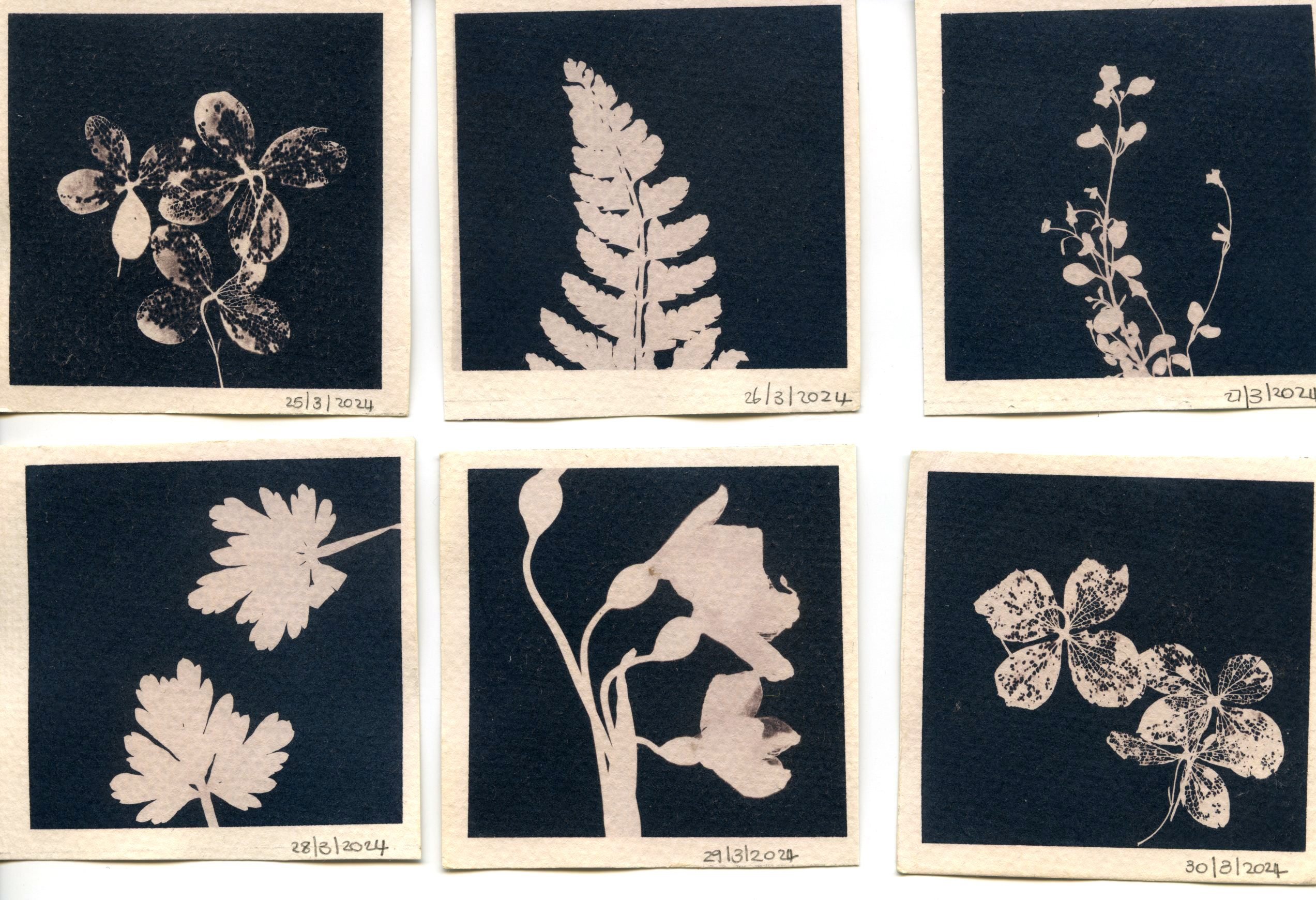
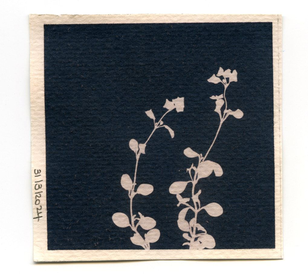
Week 13: 25-31 March: Cyanotype prints with green tea.
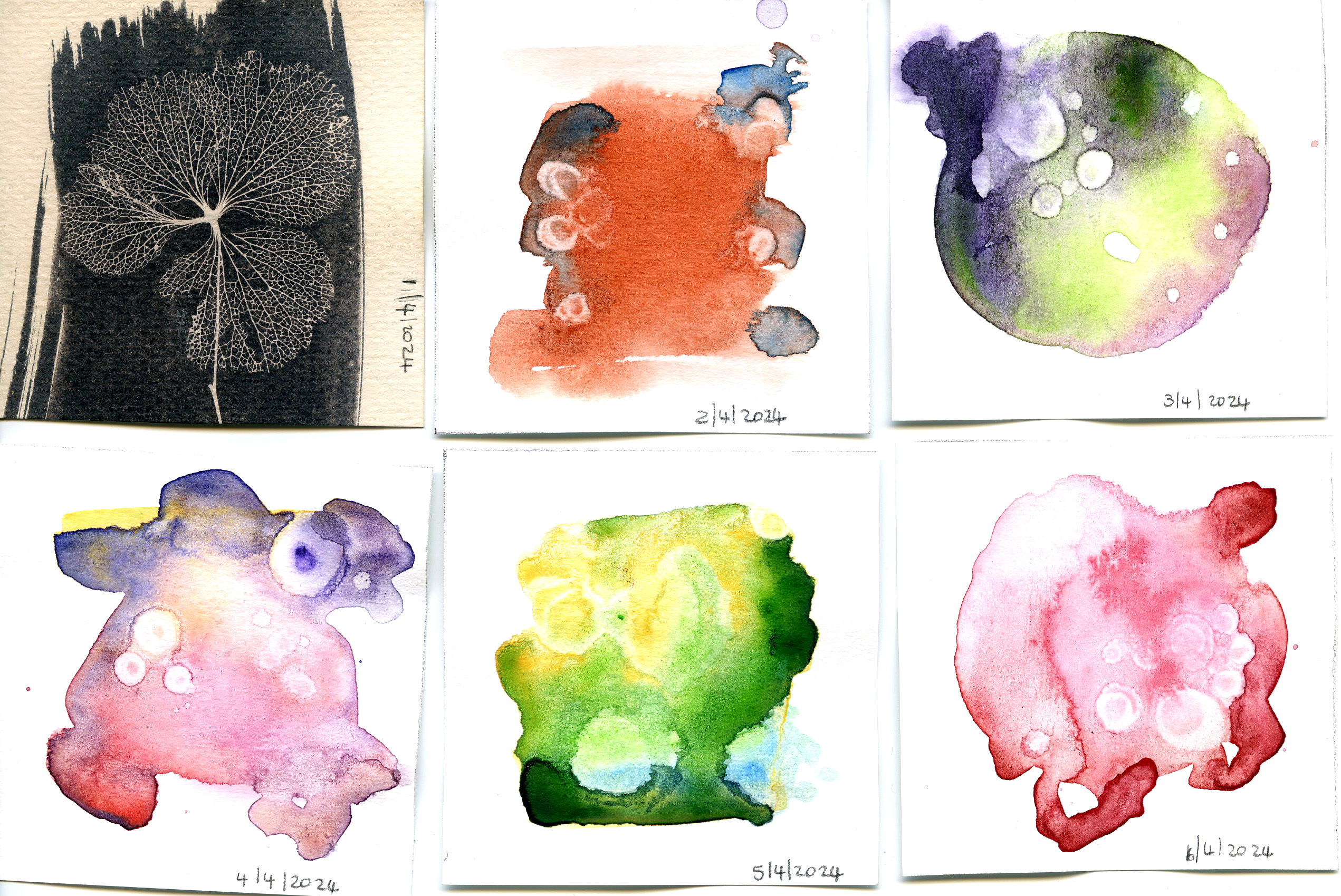
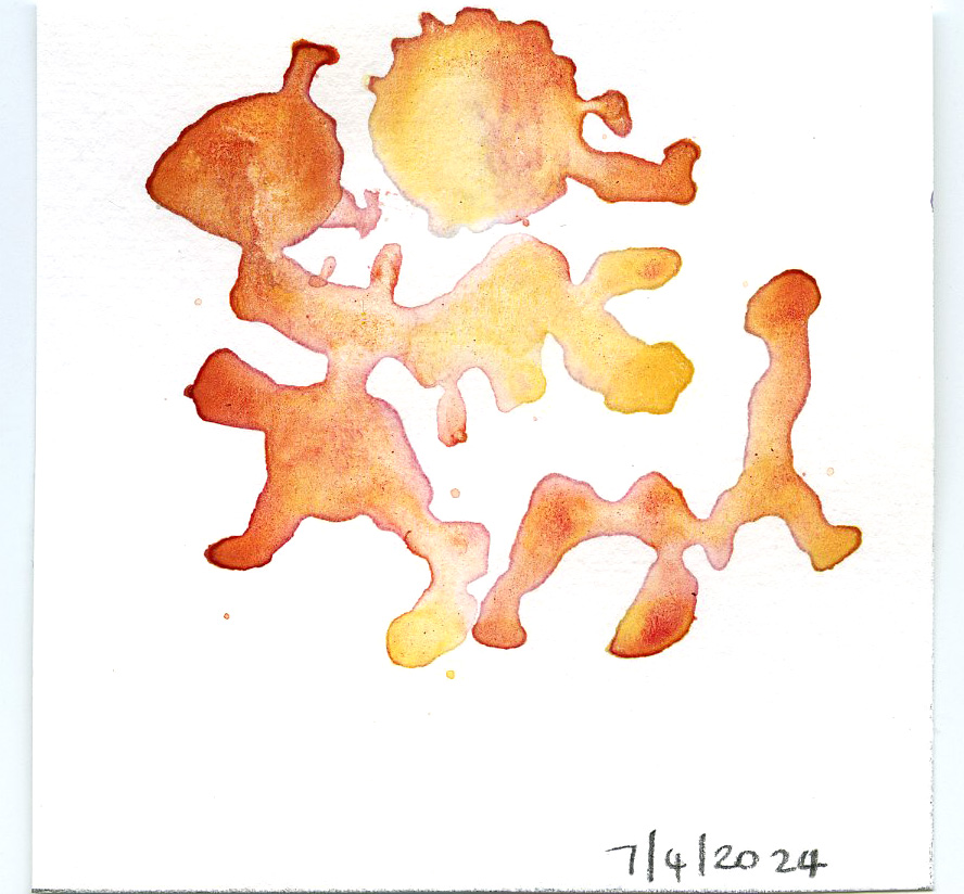
Week 14: 1 – 7 April: 1 April still Cyanotype print with Green Tea of flower skeleton, 2-7 April: watercolor and alcohol
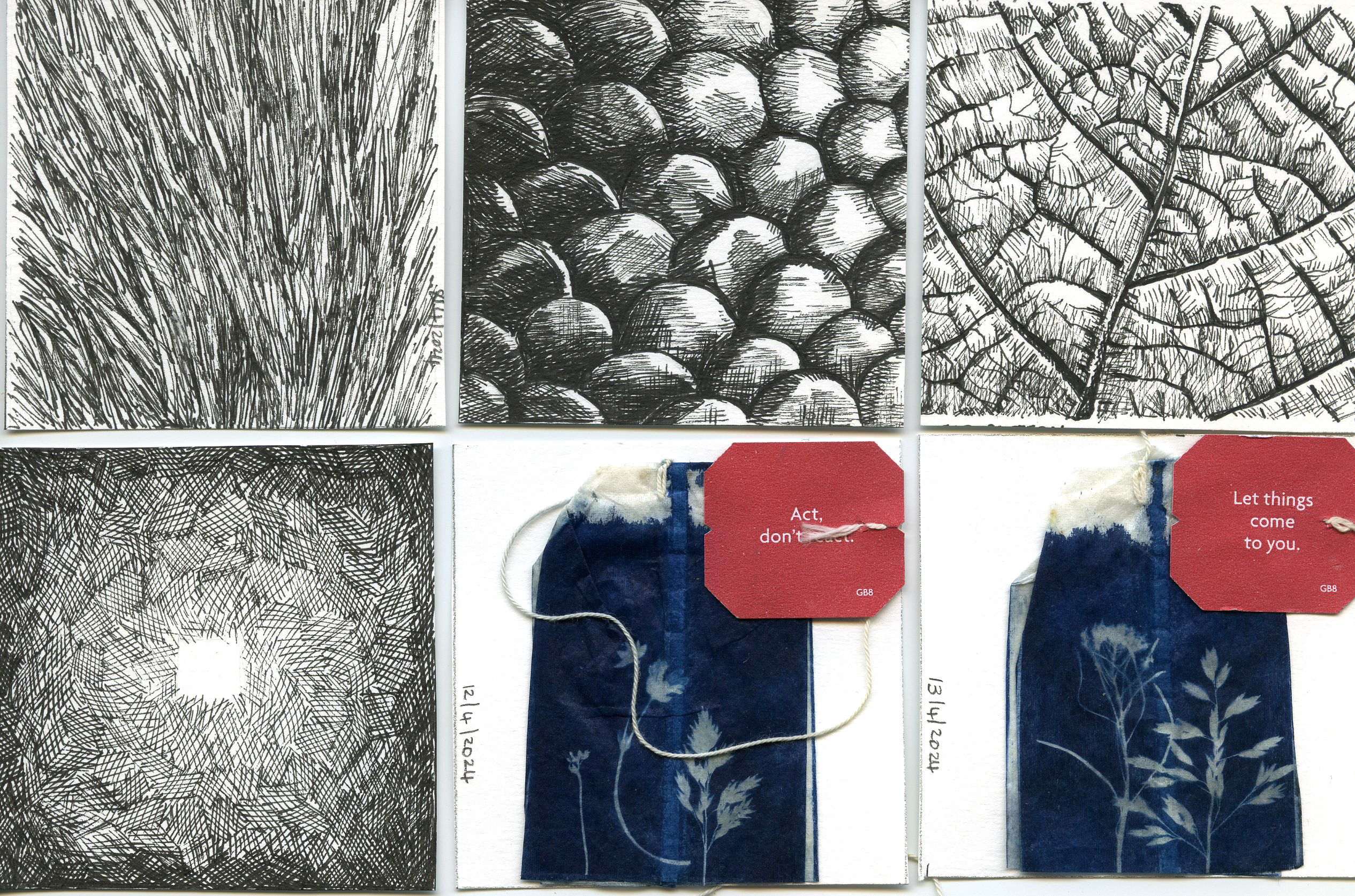
Week 15:
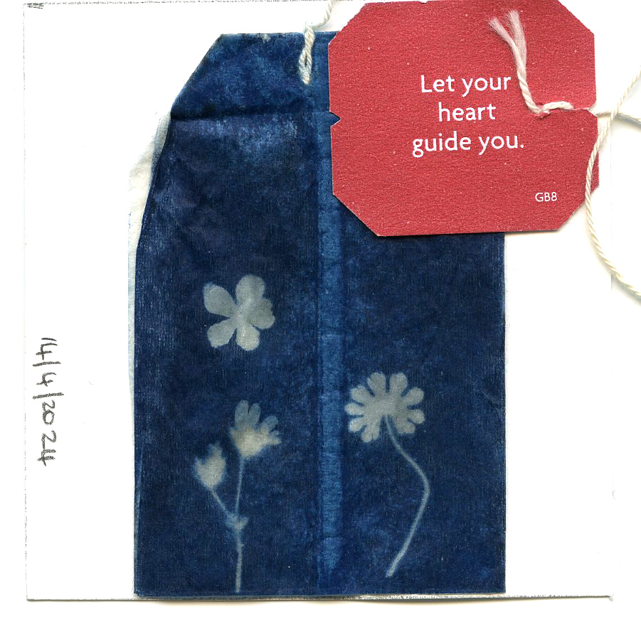
8 April: Fineliner texture – hair, 9 April: Fineliner texture – scales, 10 April: Fineliner texture – leaf, 11 April: Fineliner texture – light hole, 12 April: Teabag Cyanotype – Act, don’t react, 13 April: Teabag Cyanotype – Let things come to you, 14 April: Teabag Cyanotype: Let you heart guide you.
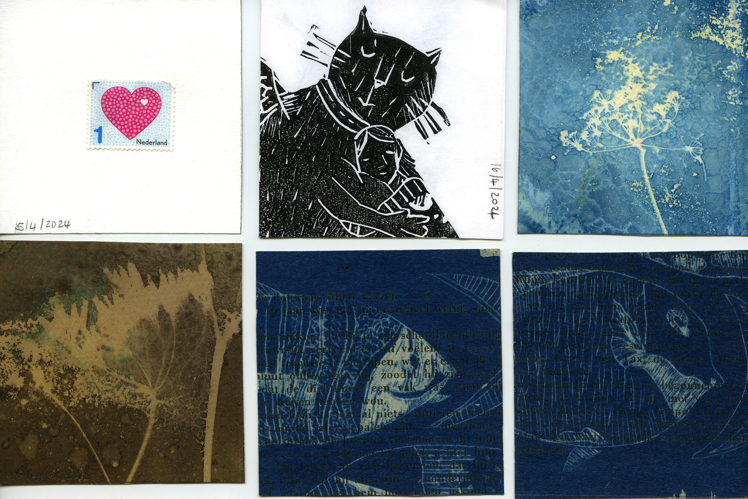
Week 16:
15 April: A baby is born, 16 April: ink print cat love, 17 april: wet cyanotype with turmeric, 18 april: wet cyanotype with turmeric – dyed in coffee, 19-20 April: fish drawings on plastic, cyanotyped onto old book paper, 21 April: wet cyanotype dyed in coffee.
Week 17:
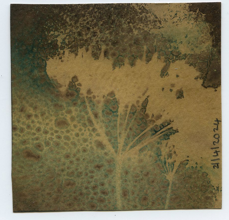
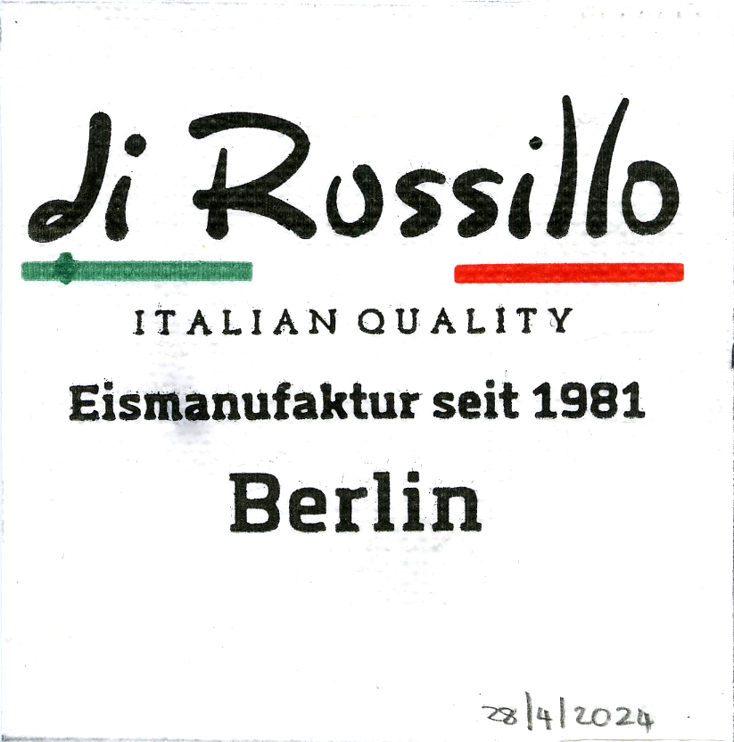
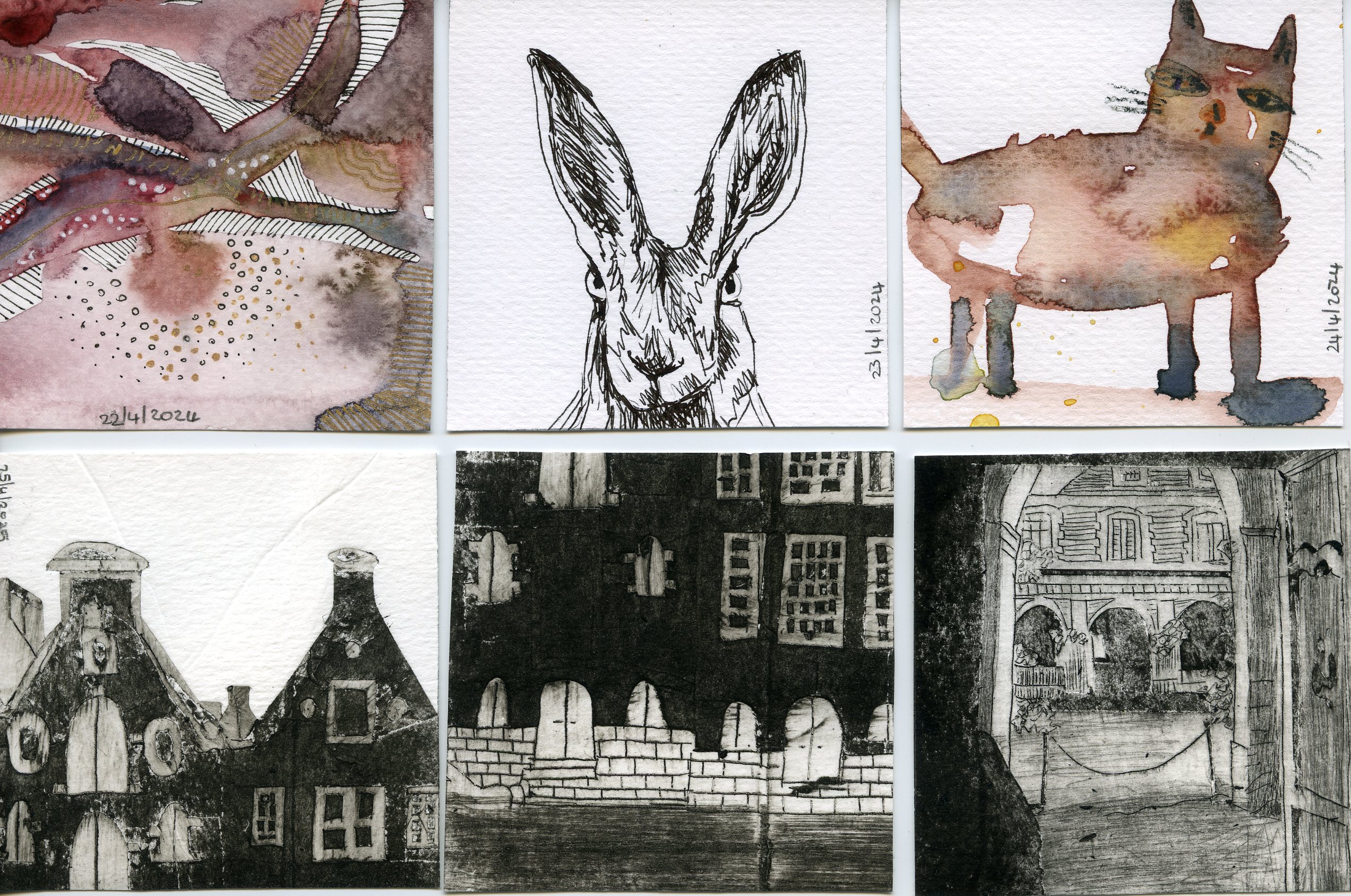
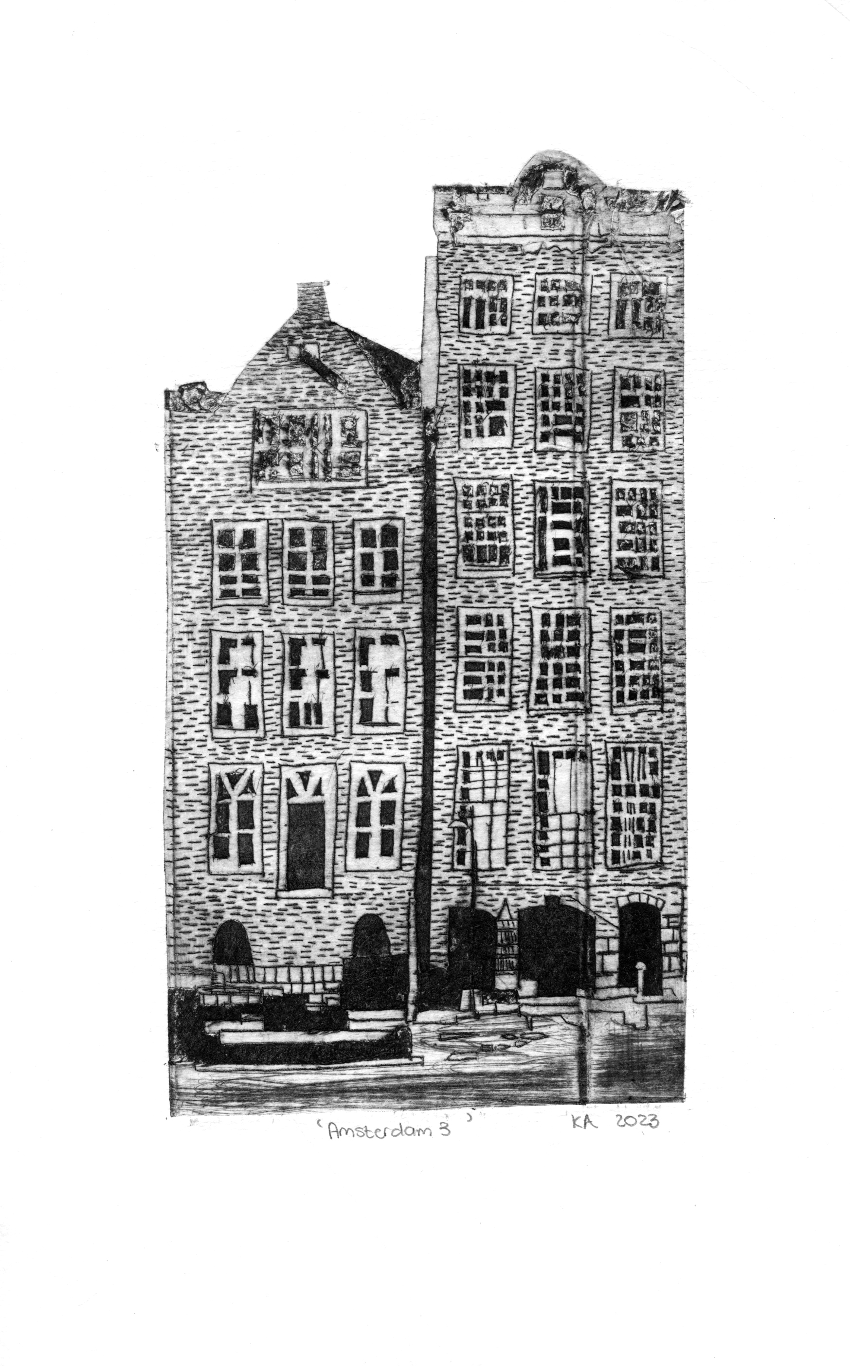
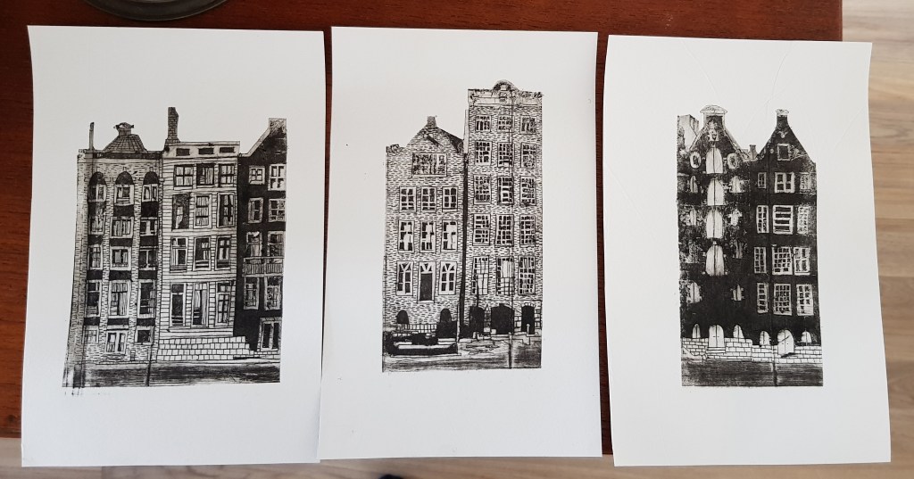
22 April: Pen and watercolour abstract art, 23 April: Rabbit fineliner sketch, 24 April: Goofy watercolour cat, 25 – 26 April: Amsterdam Milk carton etch snippets, 27 April: Milk Carton etch – Les Jardins de Valloires Abbey, 28 April: Cherry and Pistachio ice cream in Berlin.
Week 18: Berlin week
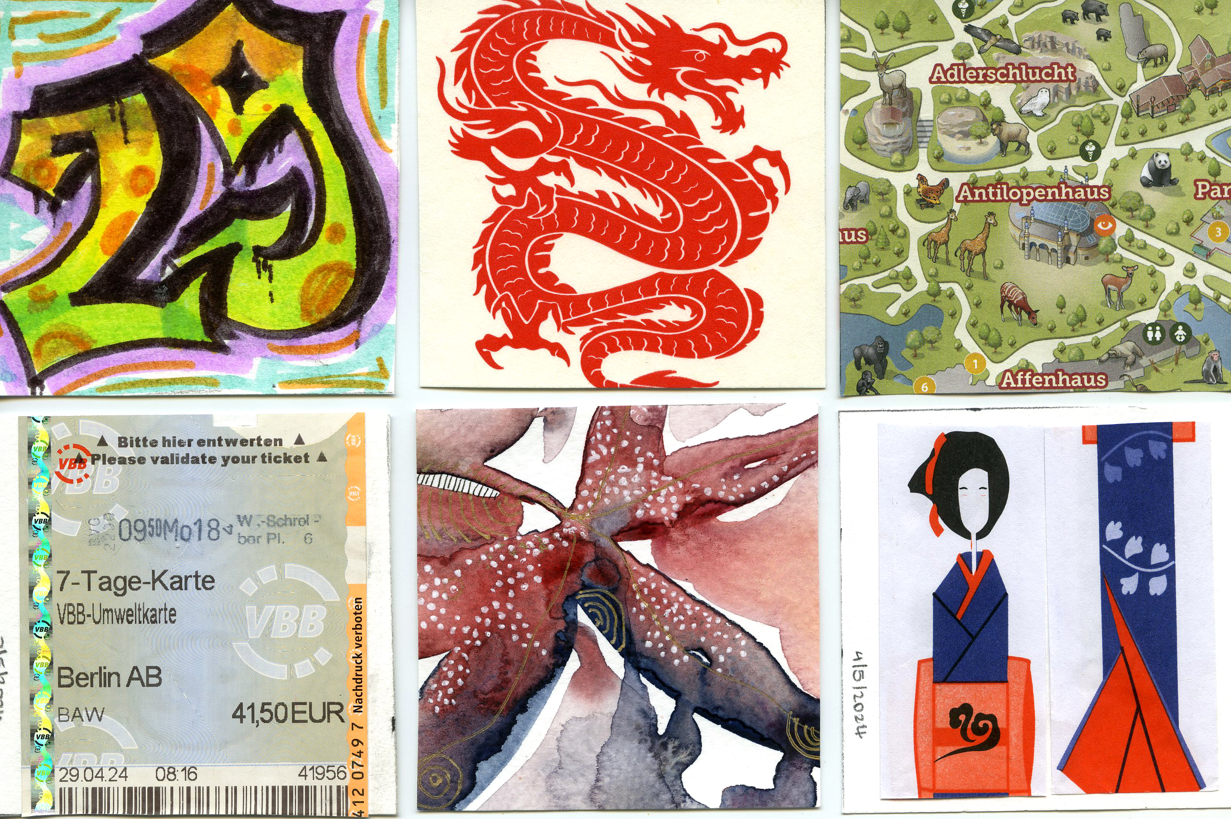
29 April: Alternative Street Art tour (artwork was done by my daughter), 30 April: some fried noodles and chicken from around the corner, 1 May: Berlin Zoo and Aquarium, 2 May: Berlin metro ticket, 3 May: Abstract art continues from last week, 4 May: sushi day, 5 May: Hamburger Bahnhof National Galerie
Week 19
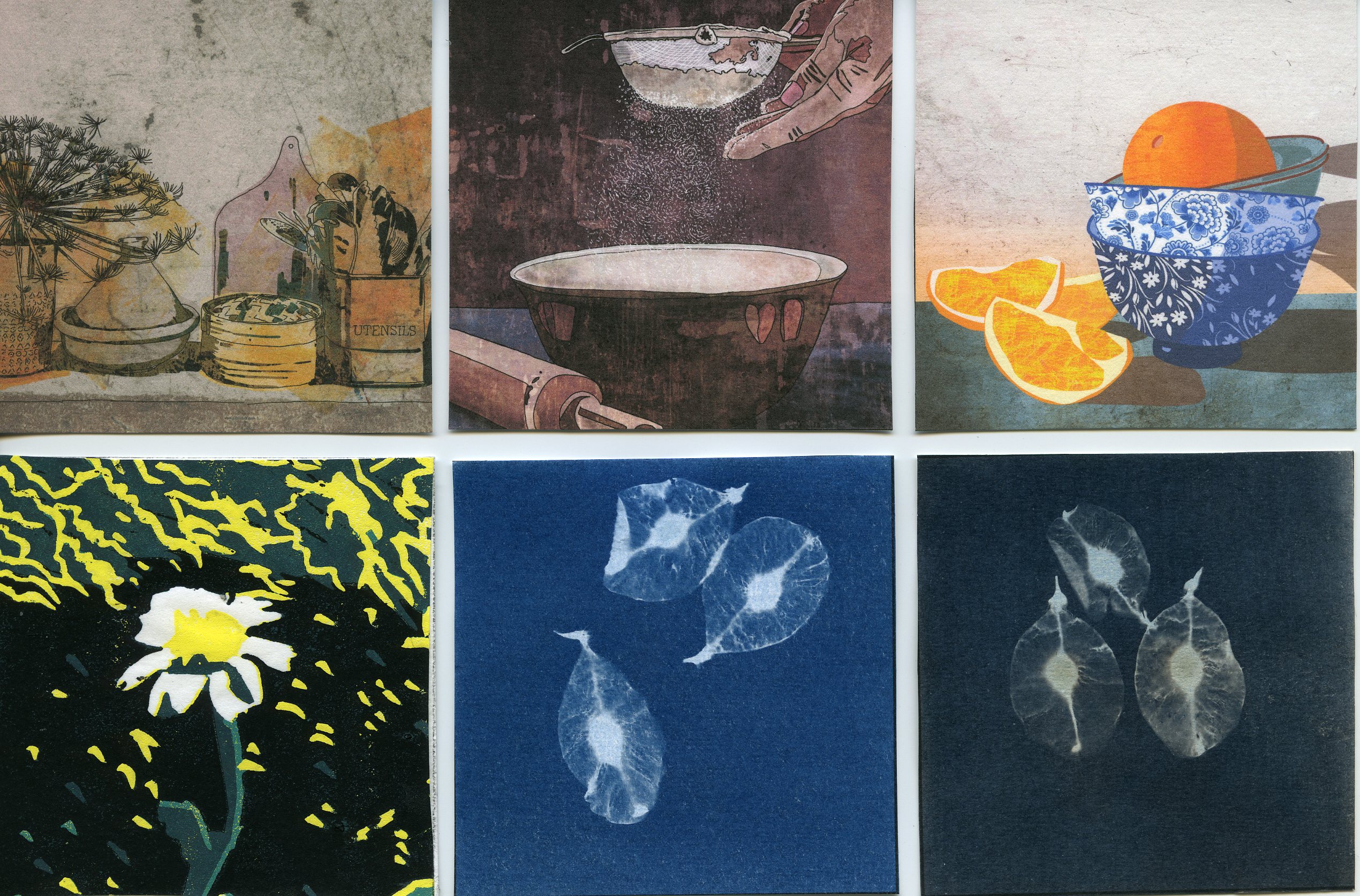
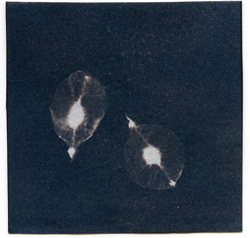
6 May: Art in the Kitchen 1 for Uppercase Magazine, 7 May: Art in the Kitchen 2 for Uppercase magazine, 8 May: Art in the Kitchen 3 for Uppercase Magazine, 9 May: Reduction Lino print, 10 May-12 May: cyanotype seeds picked up at Berlin Zoo.
Week 20
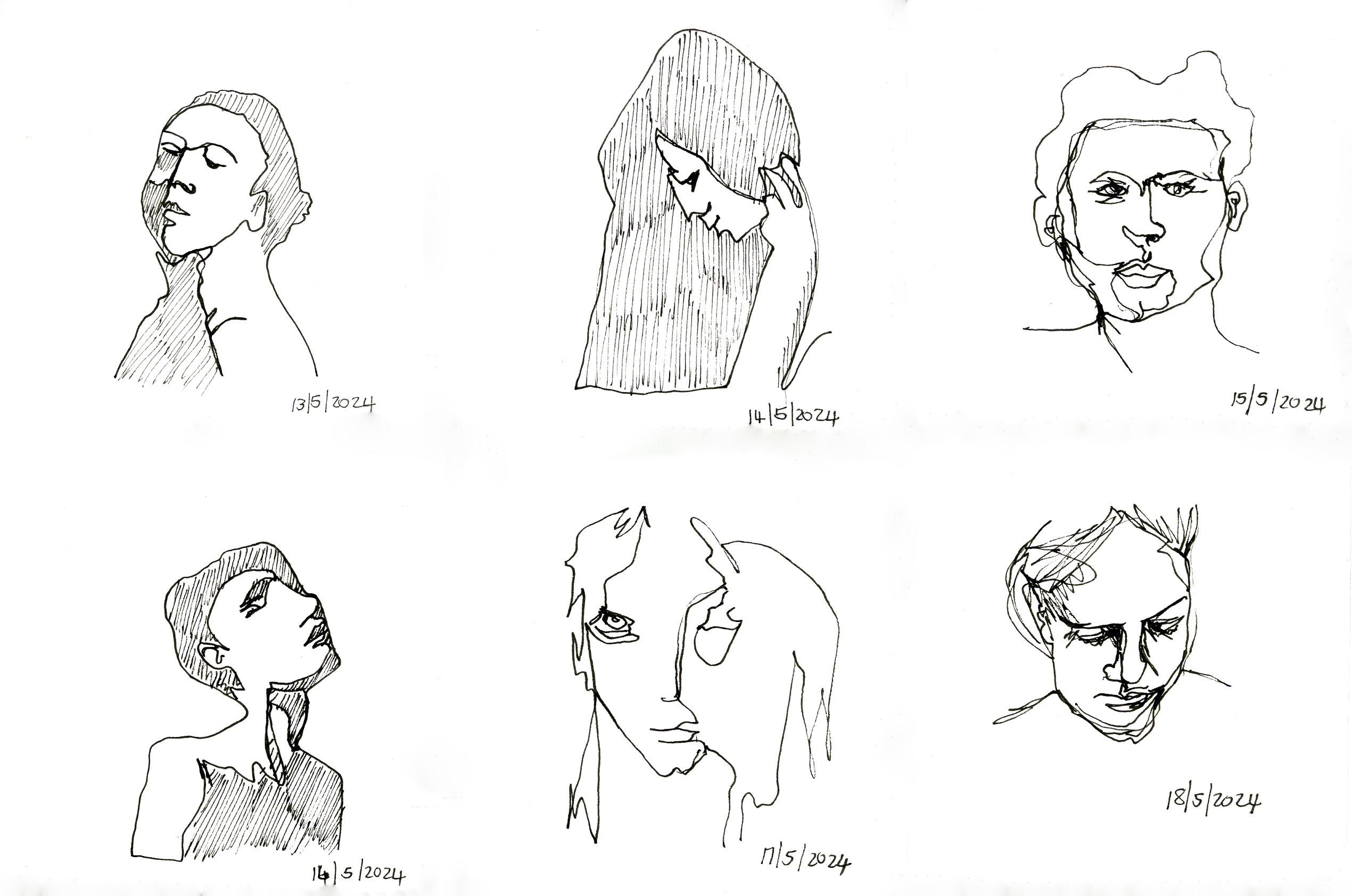
13 May- 19 May: Doodle portraits
Week 21
20-26 May: Depression: void growing in me
Week 22
27 May – 2 June: Random Object Generator
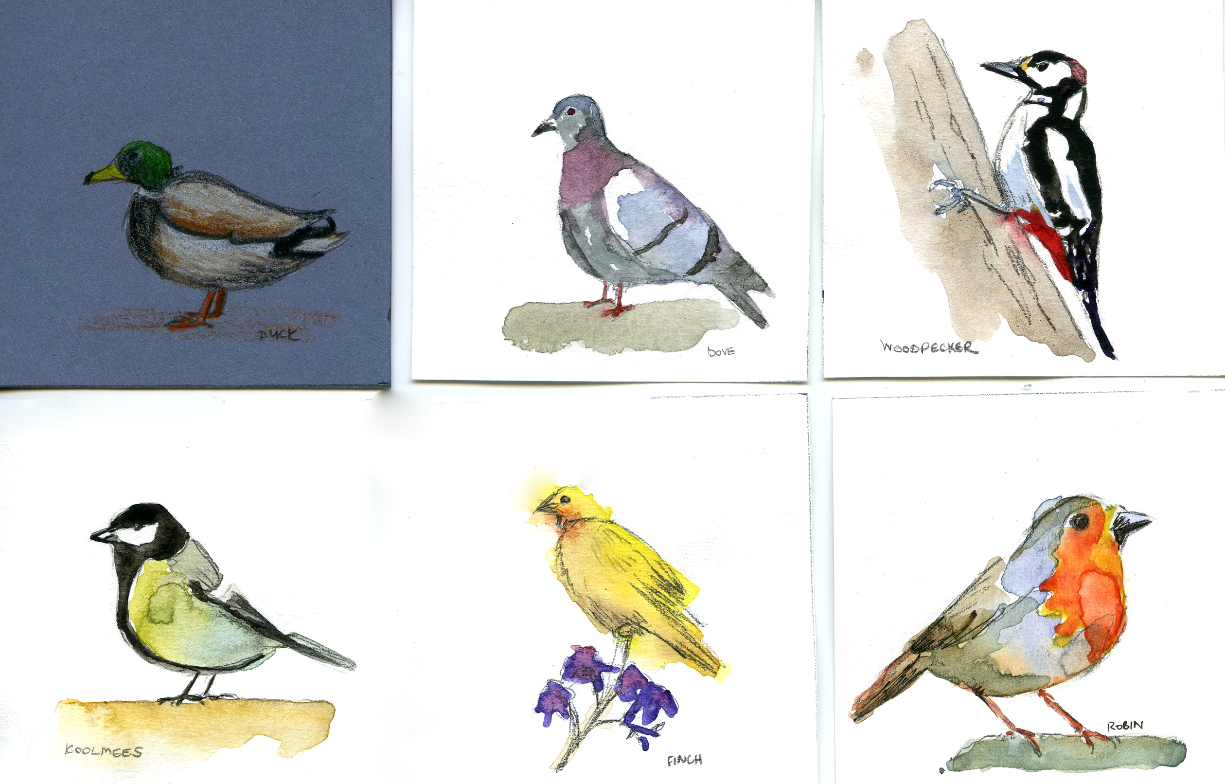
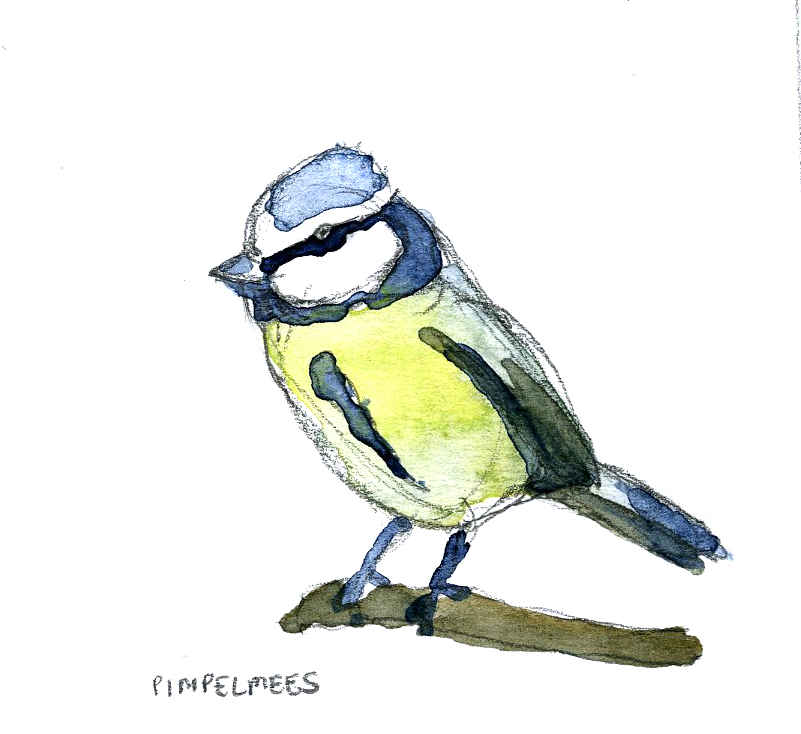
Week 23: 3-9 June: Watercolor Birds
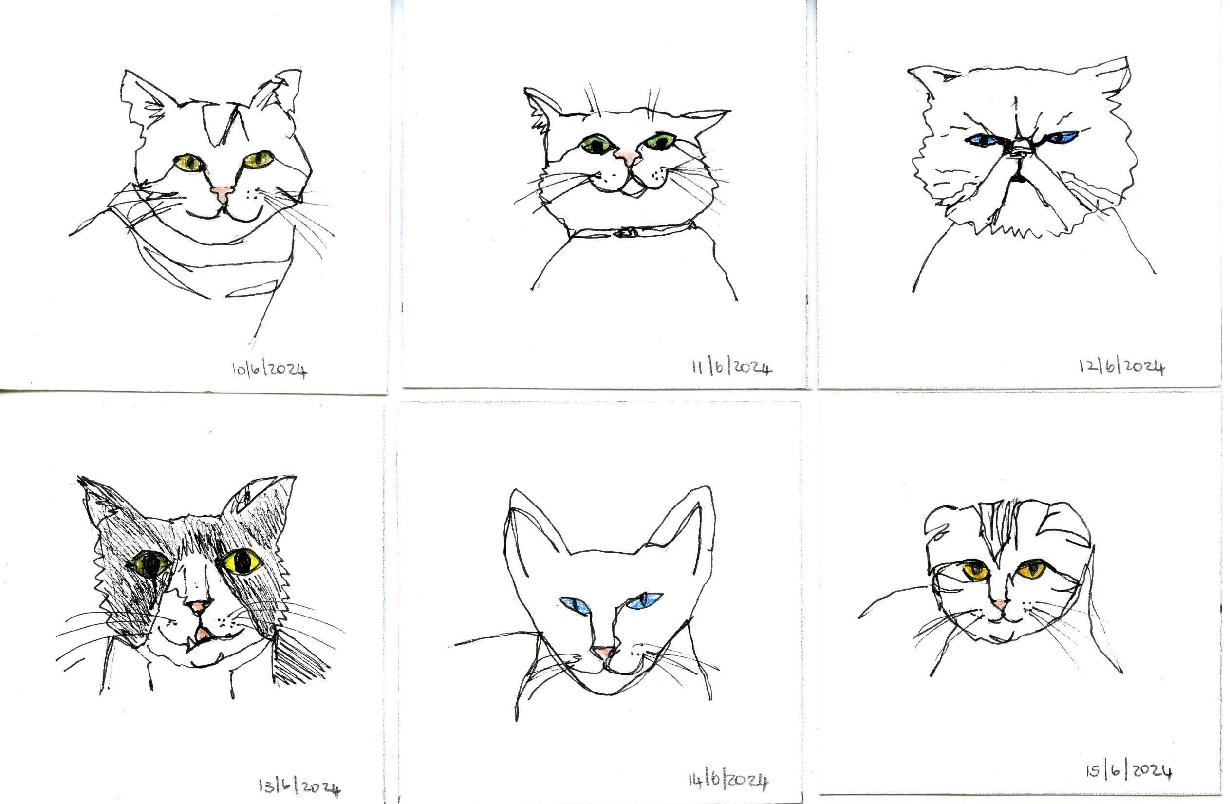
Week 24: 10-16 June: Doodle cats
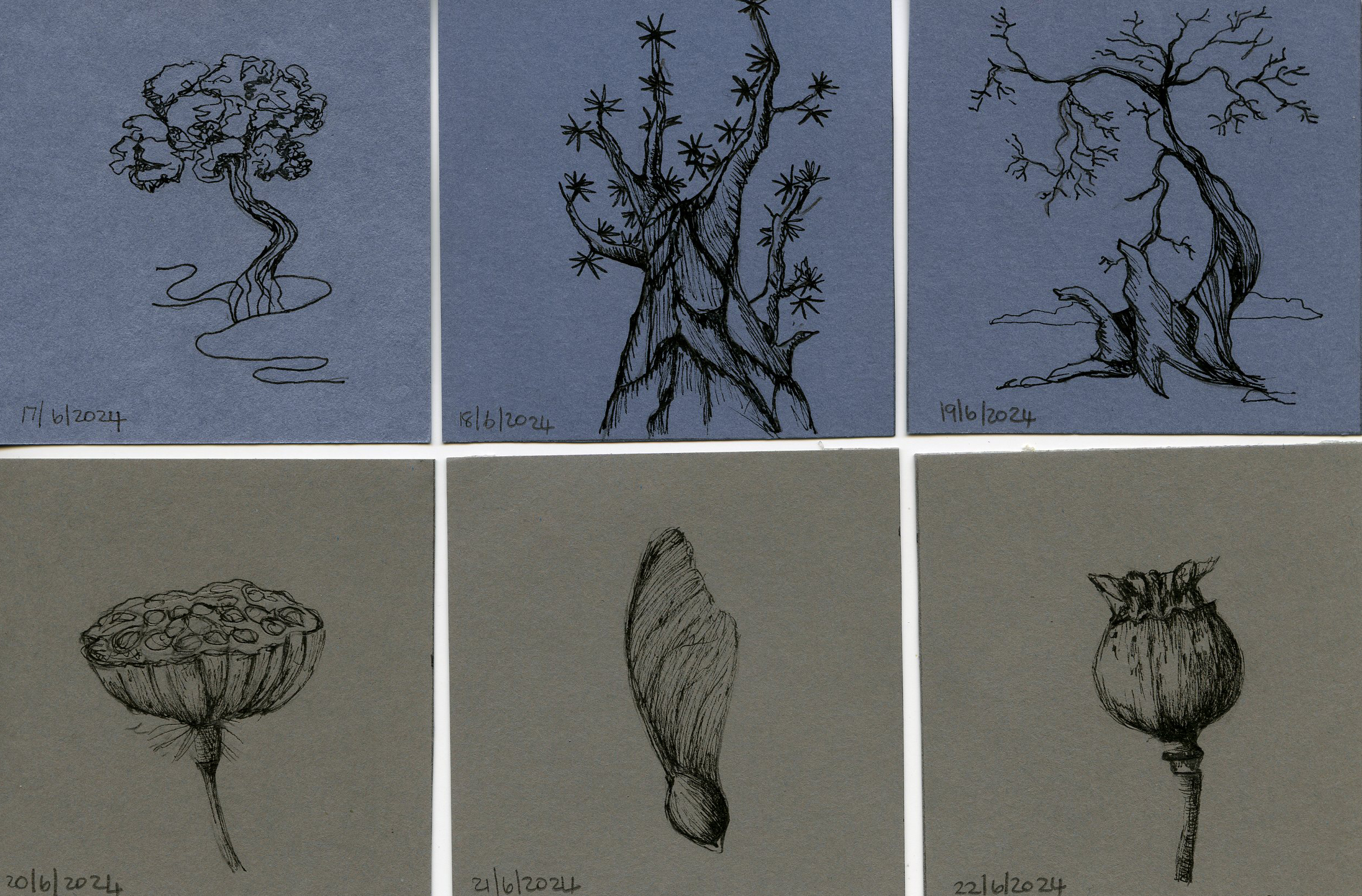
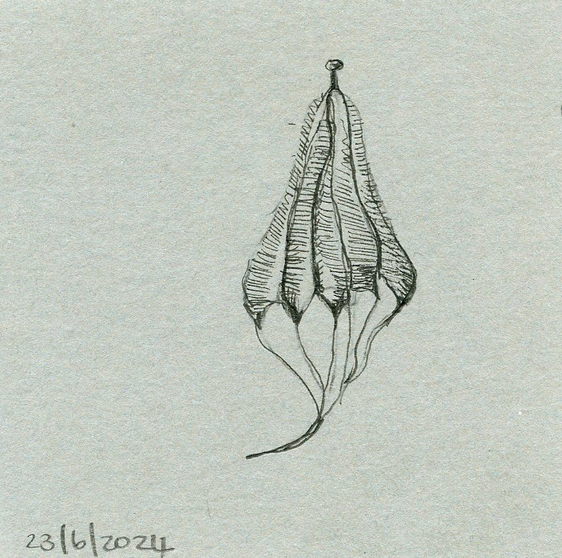
Week 25: 17-23 June: Nature sketches
Week 25: 24-30 June
24-25 June: Seed sketches, 26 June: digital and AI art, 27 June: Mushroom forest fineliner sketch, 28 June: digital art, 29 June: watercolor, 30 June: digital art
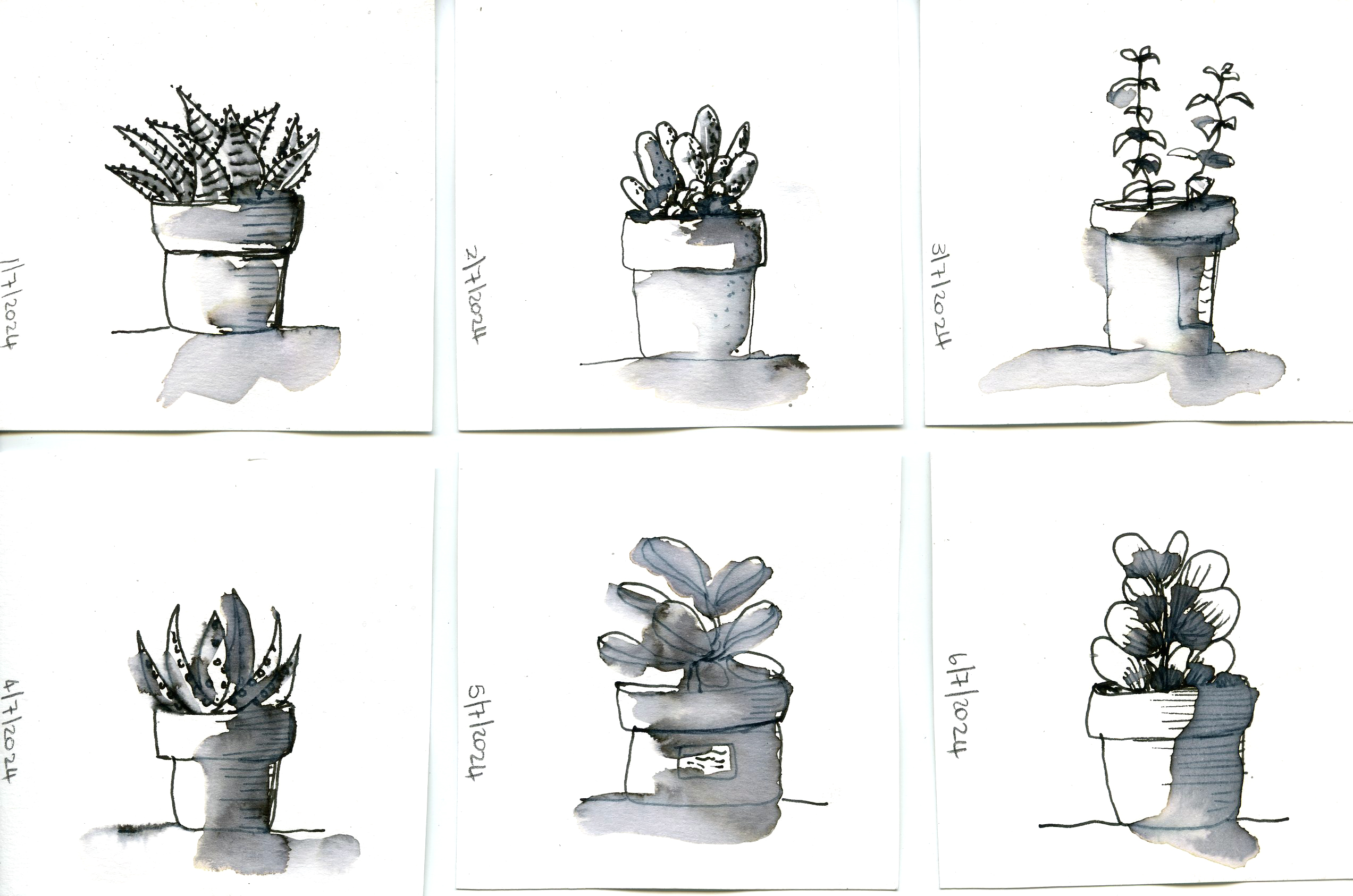
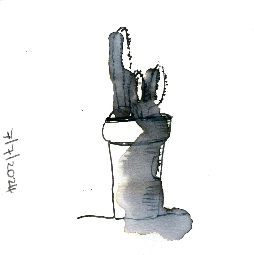
Week 26: 1-7 July: Succulents in ink
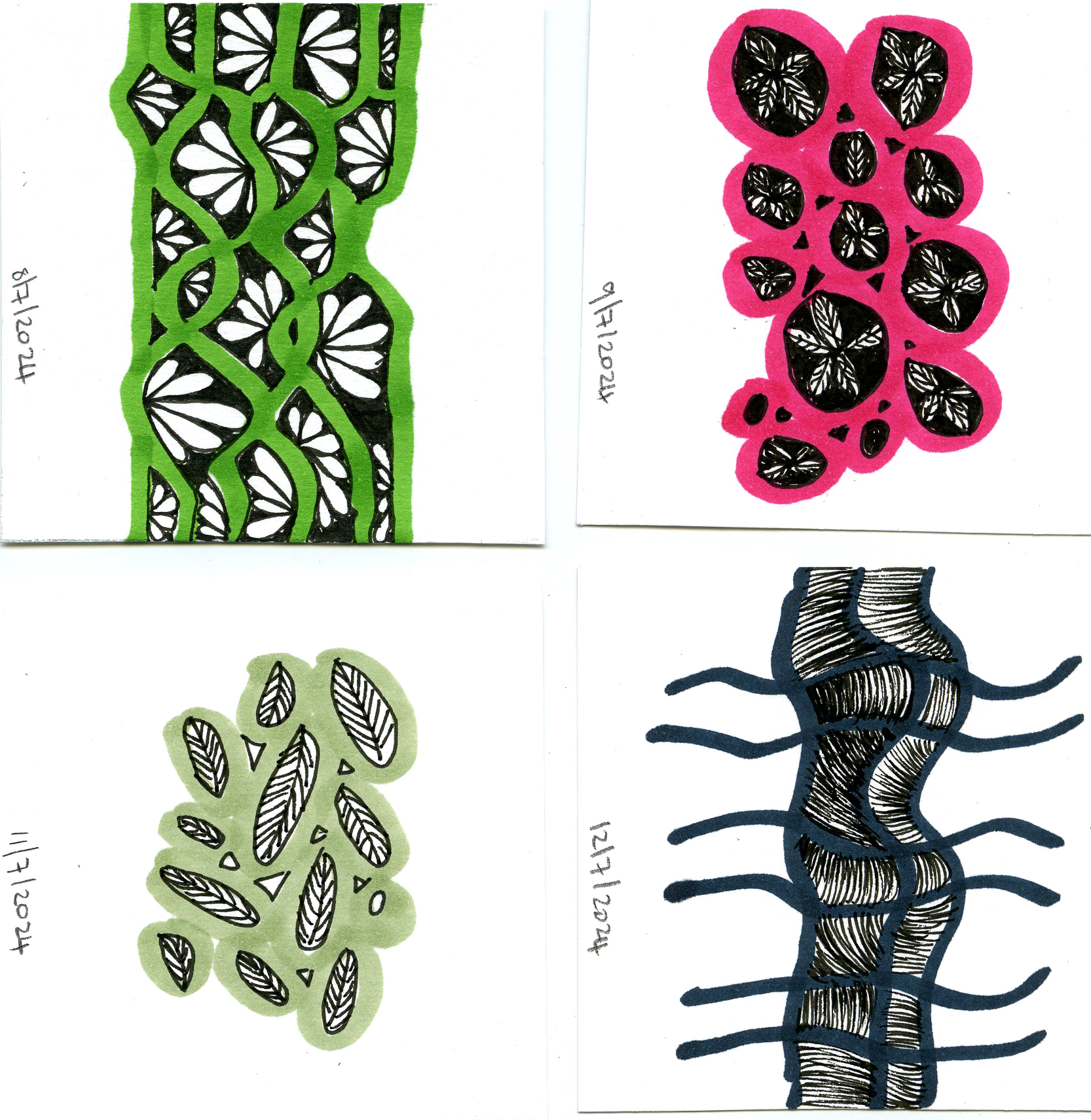
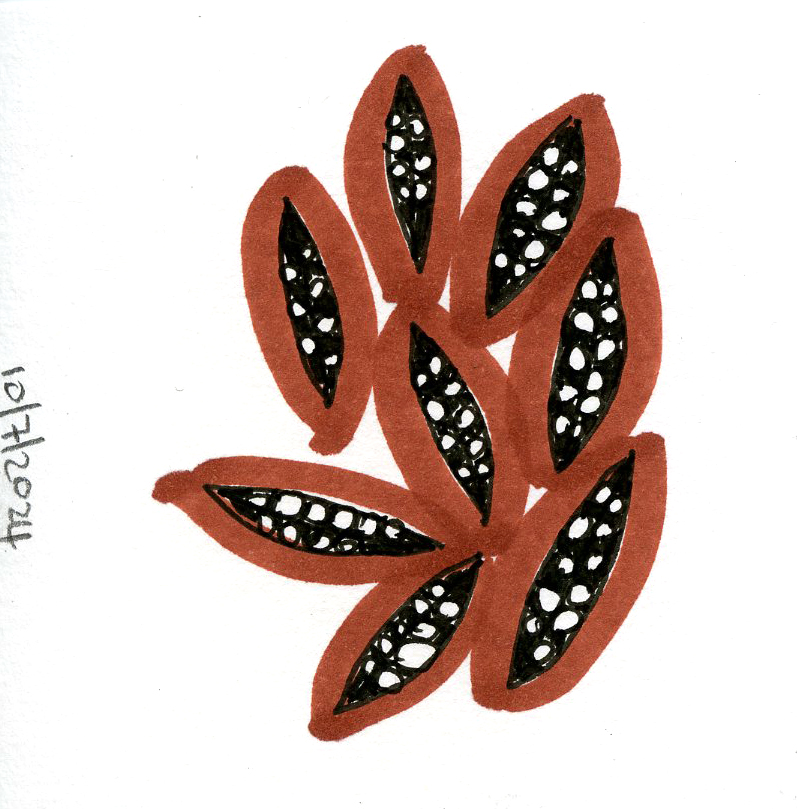
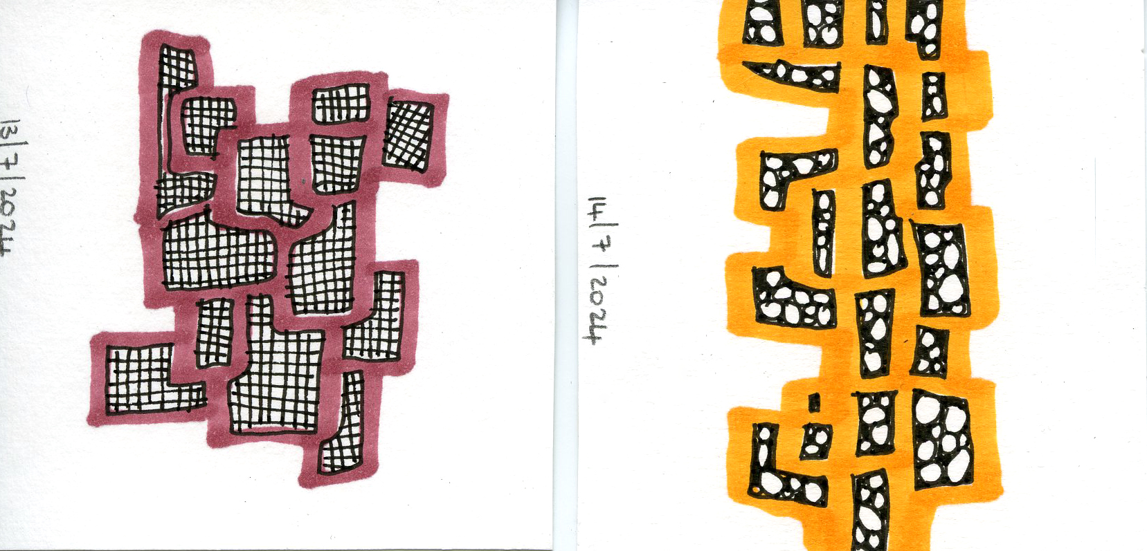
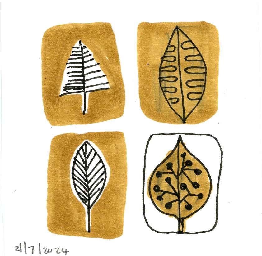
Week 27: 8-14 July: Patterns in ink and markers
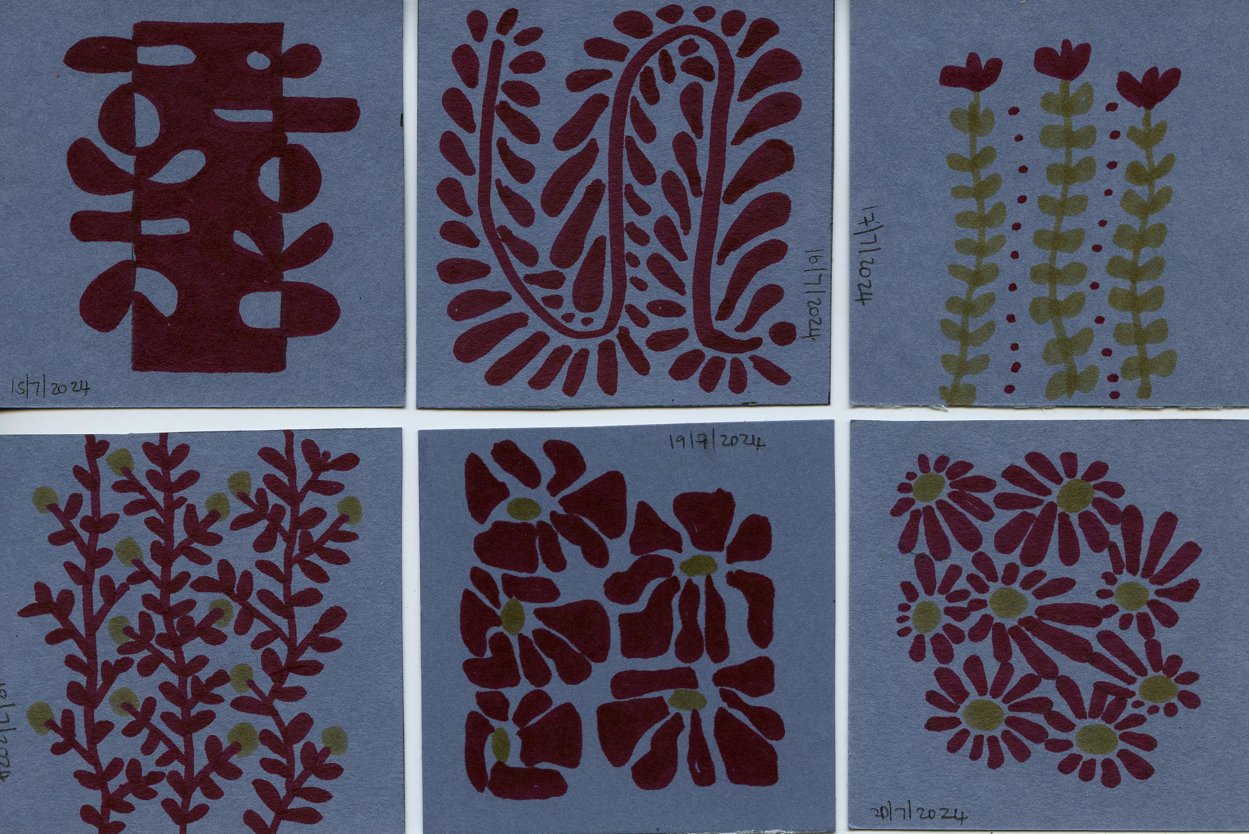
Week 28: 15-21 July: Patterns with markers on blue cardstock
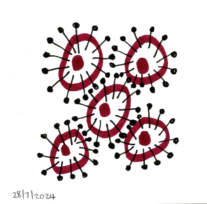
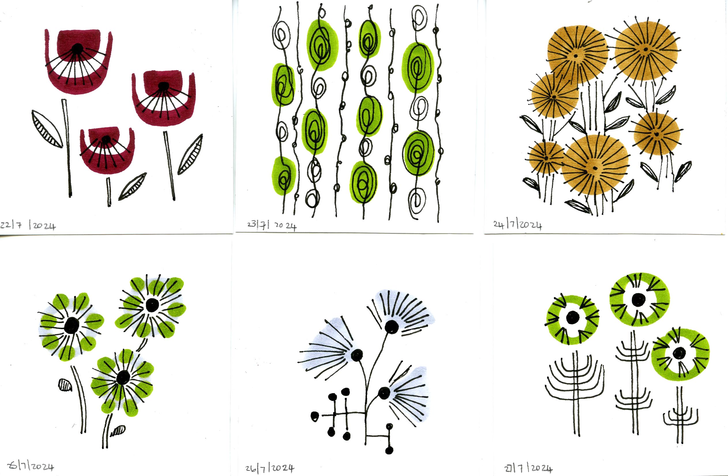
Week 29: 22-28 July: Retro patterns
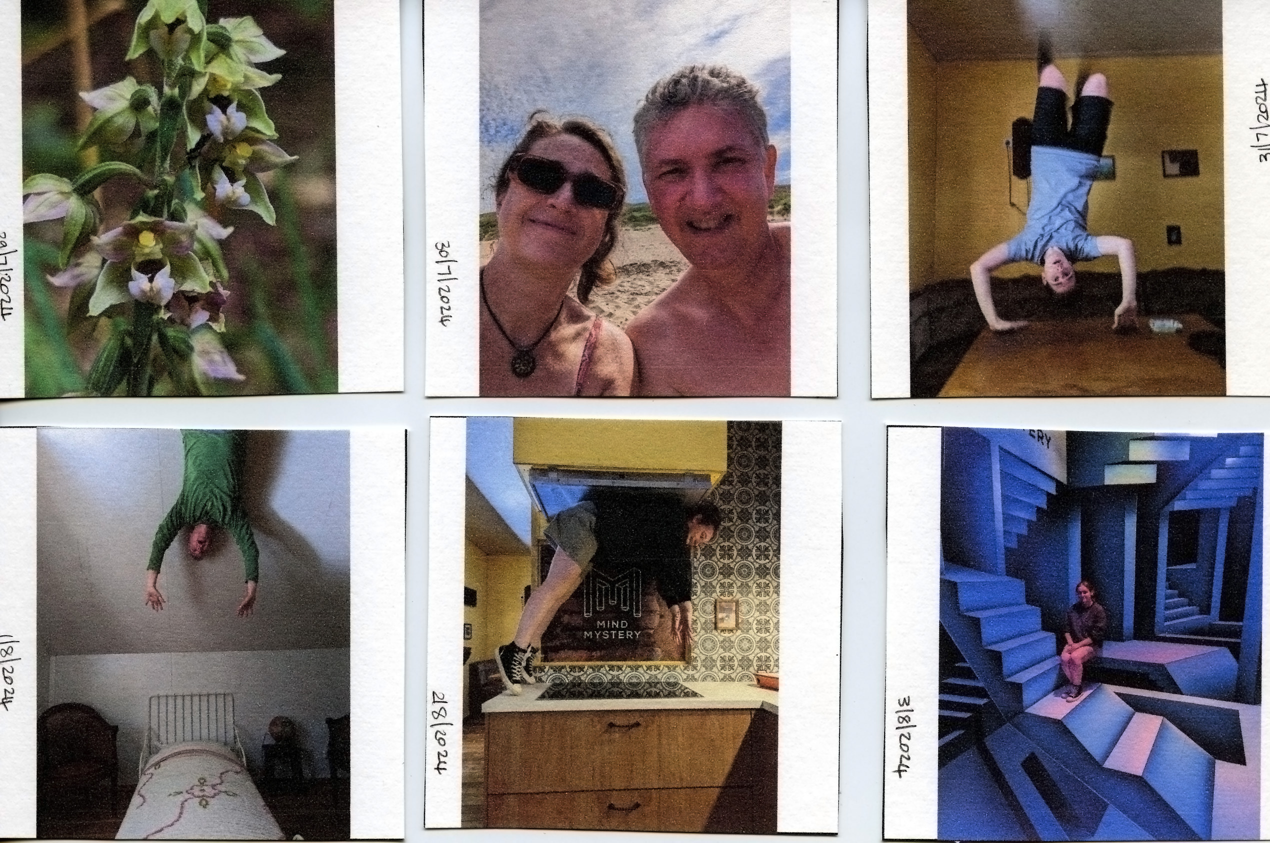
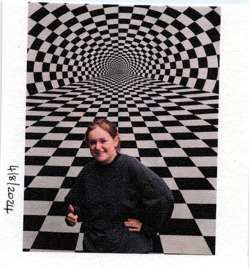
Week 30: 29 July – 4 August: Pics from my birthday weekend in Limburg. 29 July: Special orchid Wespenorchis found in the forest near Centre Parcs of Limburgse Peel, The Netherlands. 30 July: birthday celebration with a nice day out to the beach at Callantsoog, The Netherlands. The rest of the photo’s were taken at Mind mystery, an upside down house and optic illusion museum.
Week 31: 5 – 11 August: 10 hours of work on a color pencil botanical fantasy artwork (can be seen in my portfolio) called Effusis Natura.
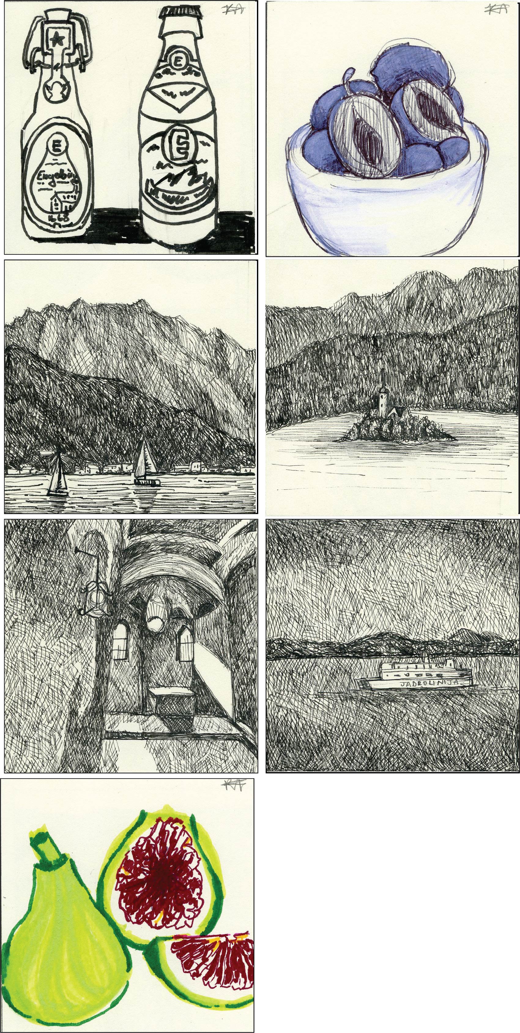
Week 32: 12-18 August – snippets from my Summer holiday trip to Croatia:12 August: Engelbrau Beer at Vorderberg, Bayern, Germany (illustration done by my daughter, Katja); 13 August: delicious zwetschgen prune plums of Austria (also done by Katja), 14 August: Traunsee, Austria, 15 August: Lake Bled, Slovenia, 16 August: Bled castle, Slovenia; 17 August: On the Ferry to Dugi Otok, Croatia, 18 August: Dalmatia figs abundant on the island (done by Katja).
Week 33: 19-25 August:
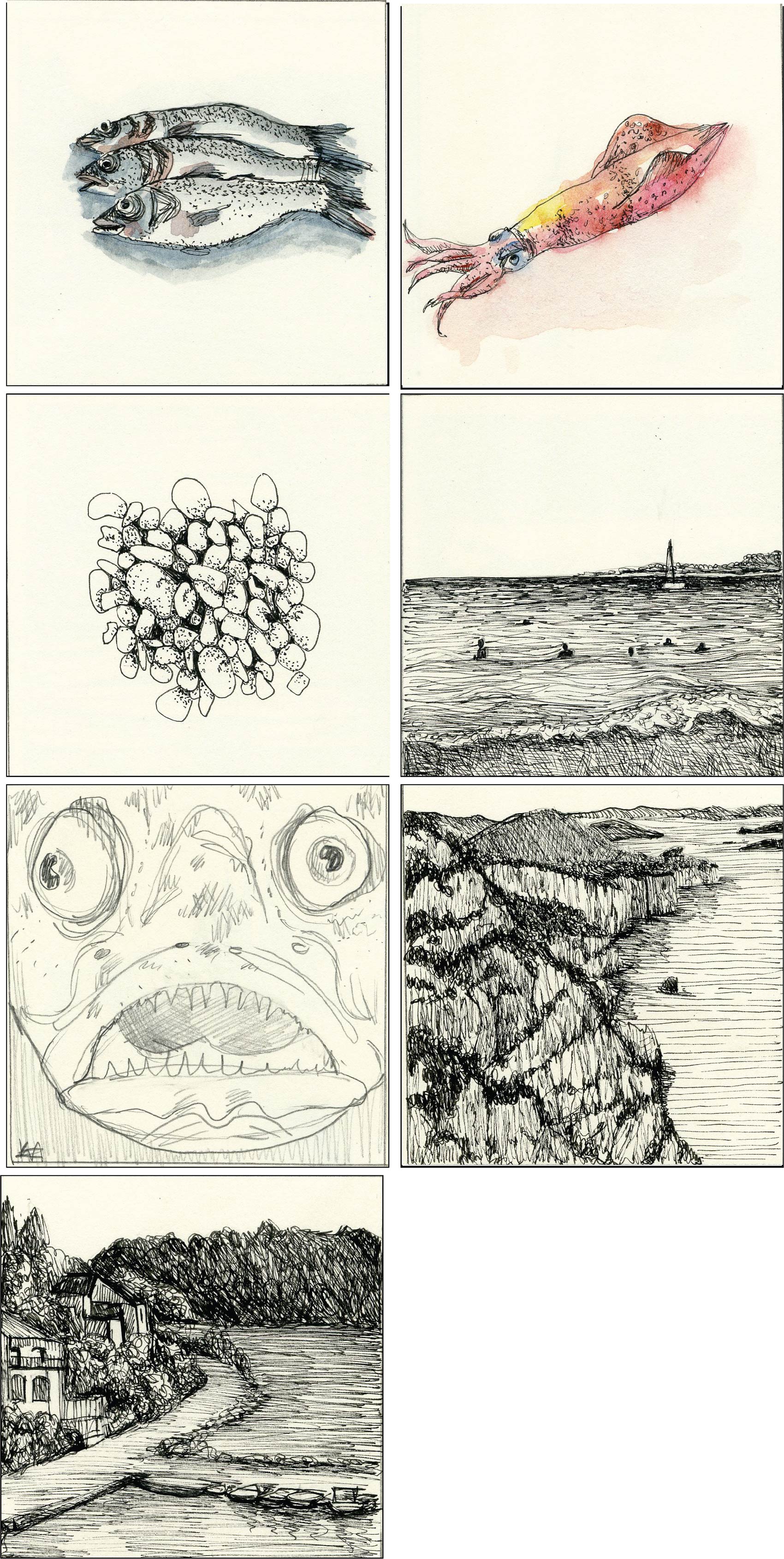
19 August: Fresh sea bass from the fish market on the island, Dugi Otok of Croatia, 20 August: Delicious filled squid as evening meal on the island, 21 August: beautiful pebble beach with turquoise sea on Dugi Otok, 22 August: swimming in the beautiful sea of the island every day, 23 August: Stargazer fish on a snorkel dive (illustration done by Katja), 24 August: the southern cliffs of the southern park on Dugi Otok, 25 August: my view on the harbor at Brbinj.
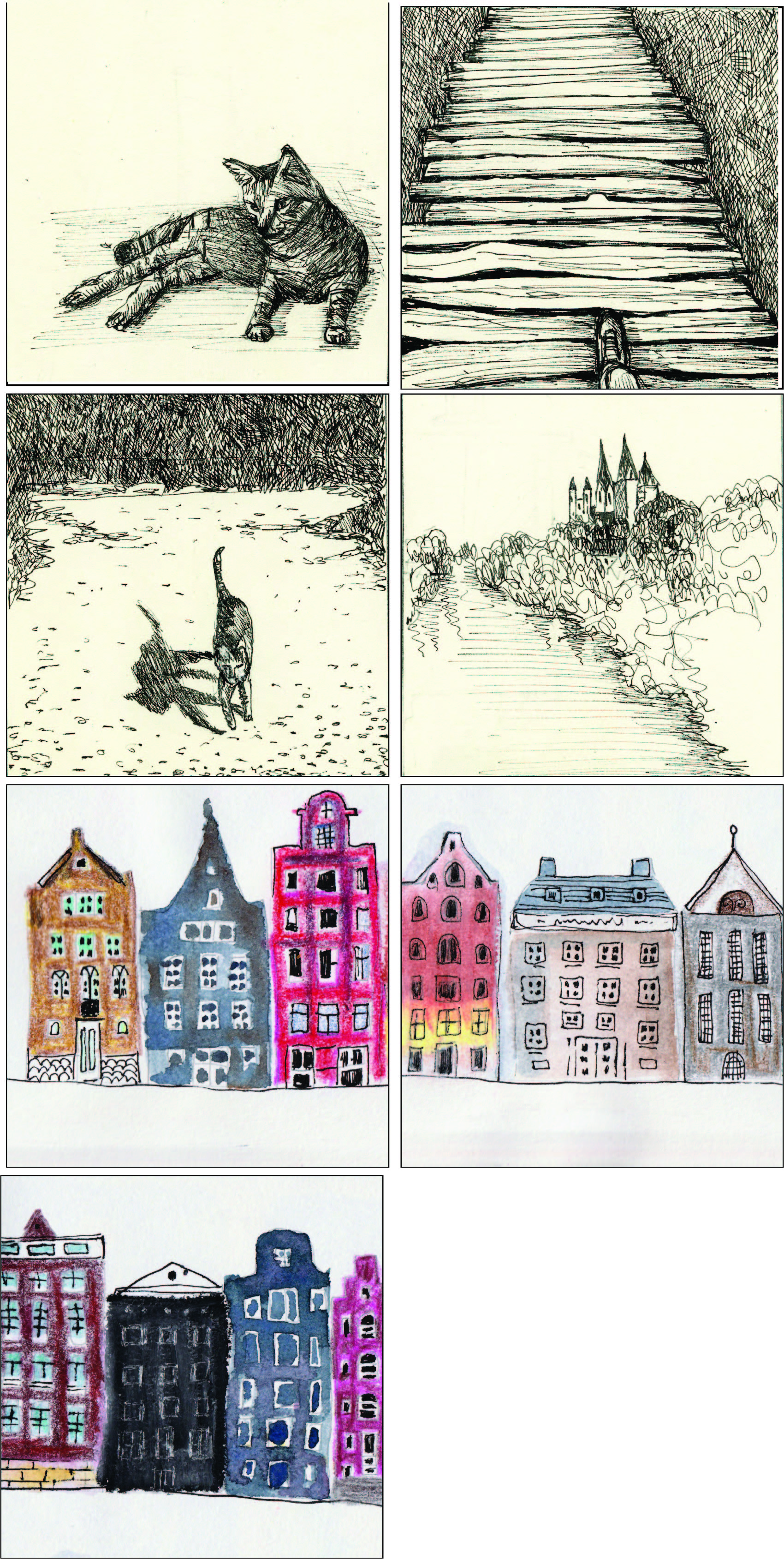
Week 34: 26 August-1 September
26 August: cat in the harbor, 27 August: The boardwalk of Plitvice Lakes Park, Croatia, 28 August: a cat from Schloss Neuburg am Inn, 29 August: Limburg an der Lahn, 30 August- 1 September: mixed media canal houses
Week 35 & 36: 2 September-15 September: Zen doodles
Week 37: 16 September – 22 September Effusis Natura 2
During every Spring and Summer season, Alkmaar is hosting the weekly cheese market on Fridays from 10:00 to 13:00 on Waagplein. This market is believed to be the most popular cheese market in the world and attracts thousands of visitors each year. It is more than 400 years old and houses around Waagplein has been demolished to increase the size of the plein. Although cheese are not traded in the same manner today, this beautiful tradition gives an insight on how cheese were carried, evaluated, weighed and sold back in the 16th century. As a newcomer into the Netherlands, you first visit all the touristic attractions and then it become the ‘normal’. For me the cheese market will always be special as it was one of the first trips I did with my children when we arrived in the Netherlands. I still enjoy the spectacle and it is also a first on the agenda when family or friends come to visit. It is a wonderful relaxed event where you can soak up the summer sun, enjoy the beautiful city of Alkmaar and taste the local delights and cheeses of the region. There are quite a lot to do and see in Alkmaar, like the cheese museum or a boat trip on the canal.
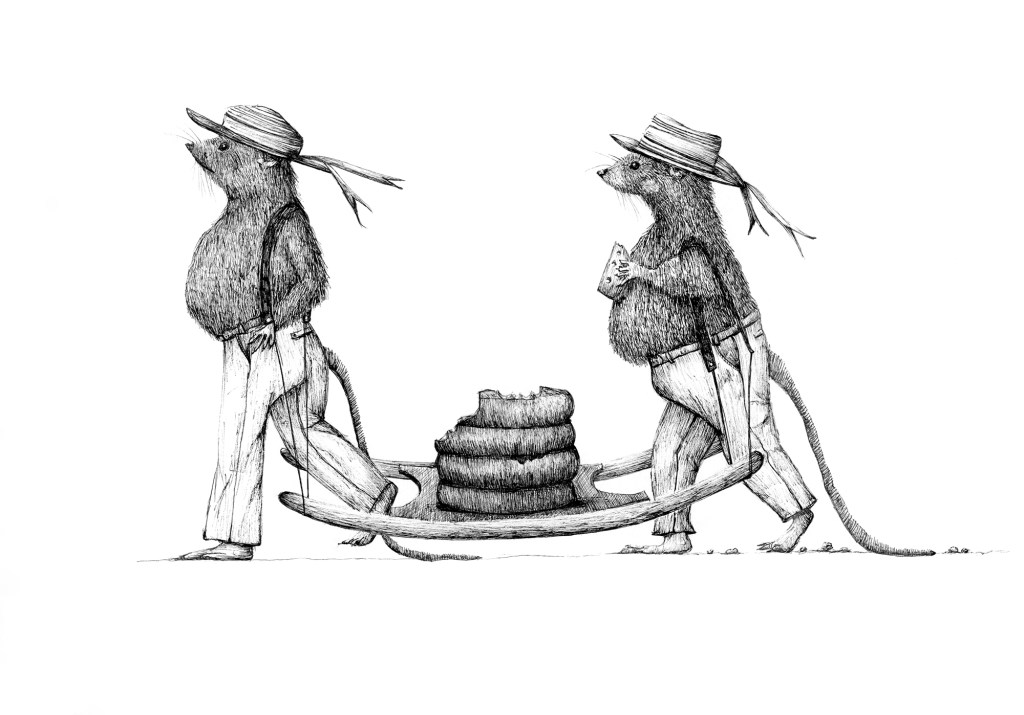
The event shows a typical day in the the selling and buying of cheese. The fist thing you will notice are the cheese carriers or Kaasdragers with the different colour straw hats, who are accompanied by the Cheese Father. They have different tasks: You have the Tasman, who is responsible for placing the weights onto the cheese scales, the Zetter who is responsible for taking the cheese from storage to the market, the Ingooier who takes the cheese from the market to storage at the end of the day, the Bootelier who is responsible for getting drinks after the market is over, and the Voorman who is the head and often the oldest member of the company.
After the market opens, testers in white lab coats, use a special scoop to take sample cheese from the cheese wheel in terms of feel, smell, and taste. They also make sure the cheese have enough holes or eyes. After a batch is sold it is carried by two men on a wooden barrow to the scales to be weighed. These cheeses can weigh up to 120 kg and the men walk in a specific rhythm in order to carry the weight more easily. The Tasman weighs it in front of the ‘Waagmeester’ to ensure the buyer gets the right amount of cheese. The unsold cheese are carried back to storage.
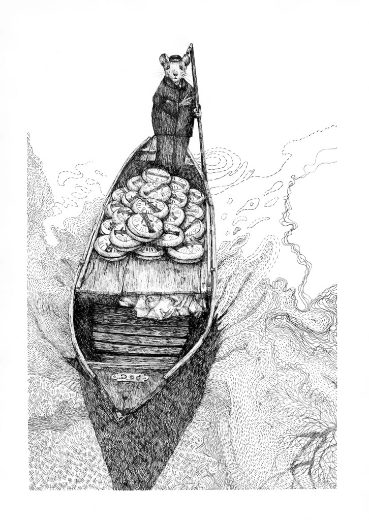
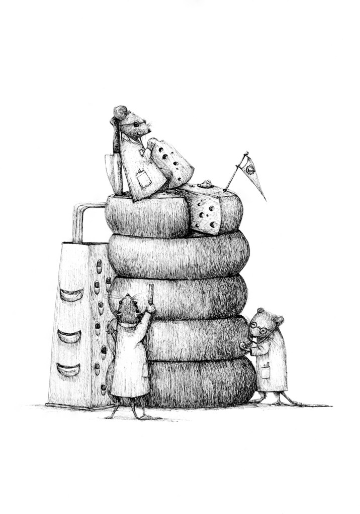
As an artist, you sometimes struggle to find the right ‘material’ or inspiration to work from, but I feel that portraying my everyday life or a peek of my life in The Netherlands, might be interesting to another person not knowing the country and its traditions. My trademark are also my storybook animals and thus combining the two will give my everyday story ‘another’ story’. I thought that this might lead to a series of illustrations depicting an event on another level.
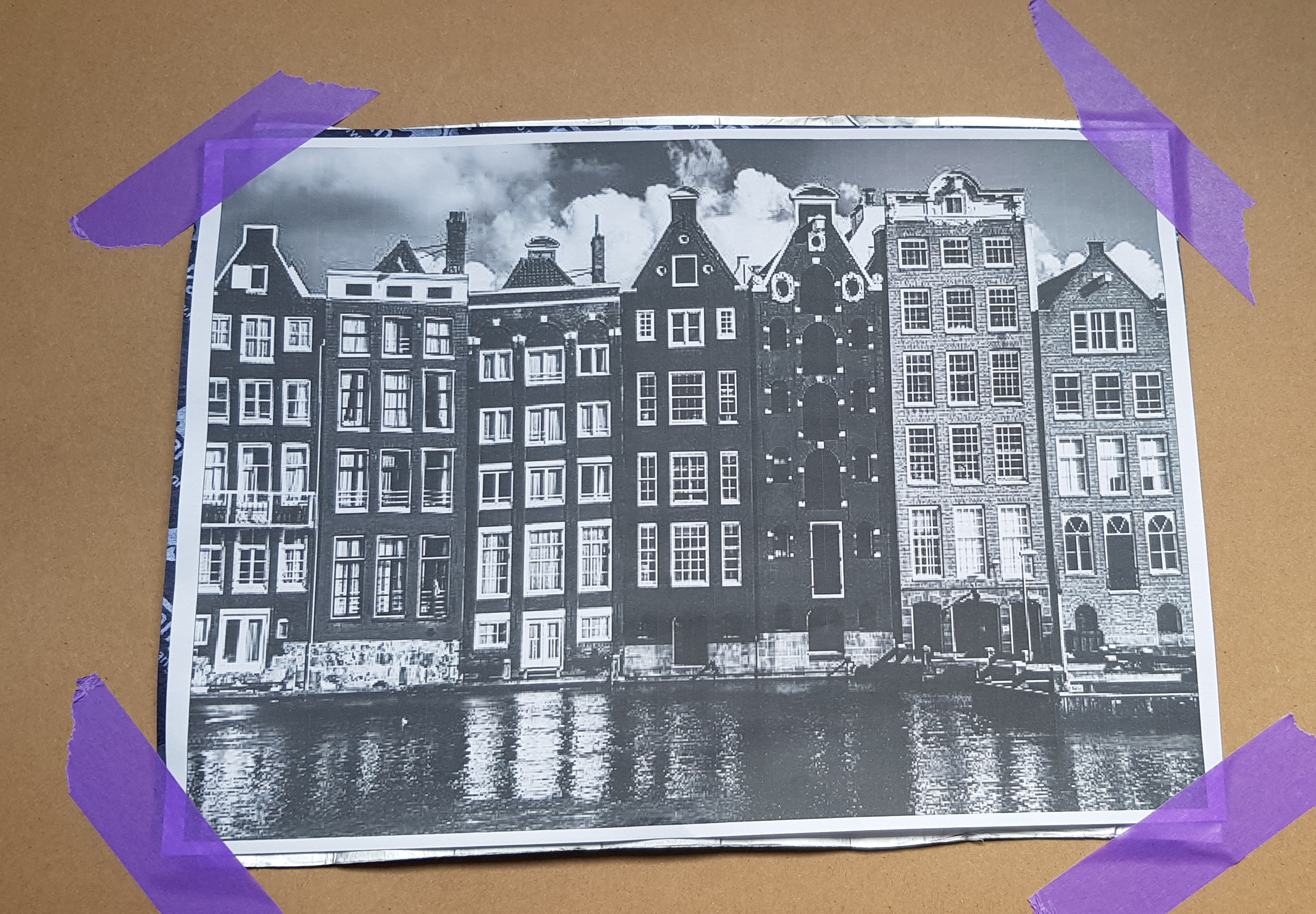
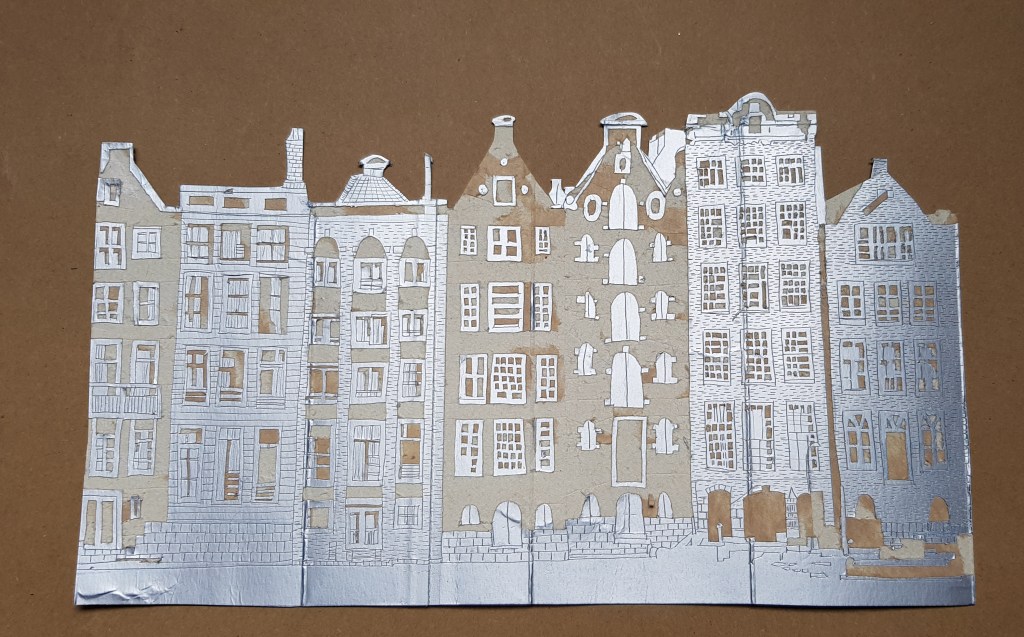
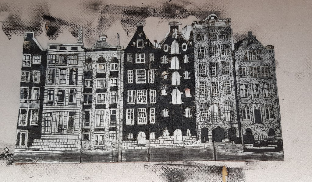
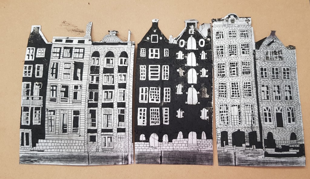
Thus the first illustration shows how the cheese were transported to the markets back in the days. Because The Netherlands have so many water canals that link cities and towns, boats were the obvious choice of transportation. Every Friday morning the cheese famers with their boats, carrying the precious golden cargo, are off to the cheese market in Alkmaar. I usually do my drawings with 0.03 Unipin markers onto 200 gsm Fabriano paper. I have used some line patterns in order to illustrate the movement of the water instead of just ‘shading’ or hatching.
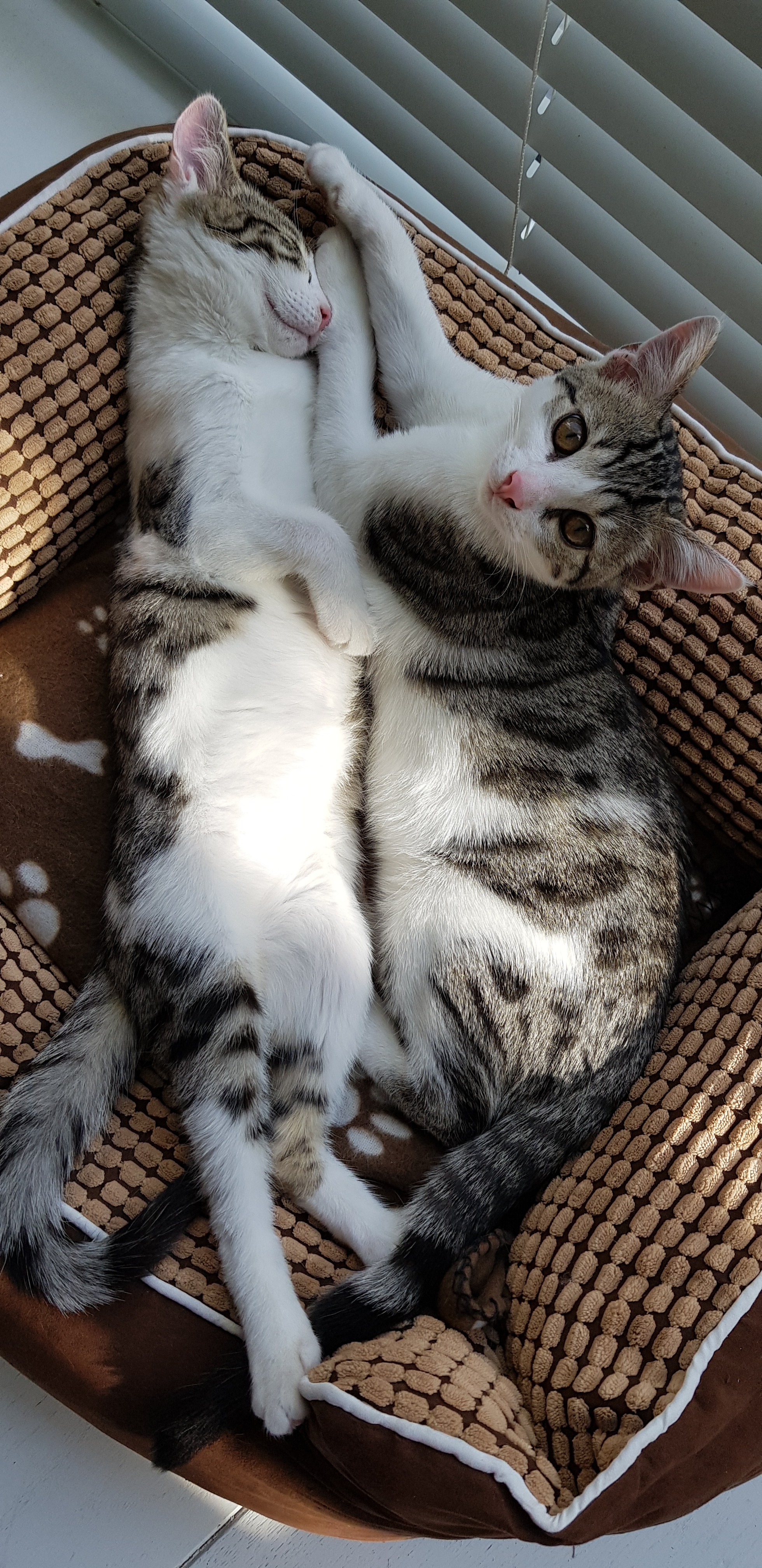
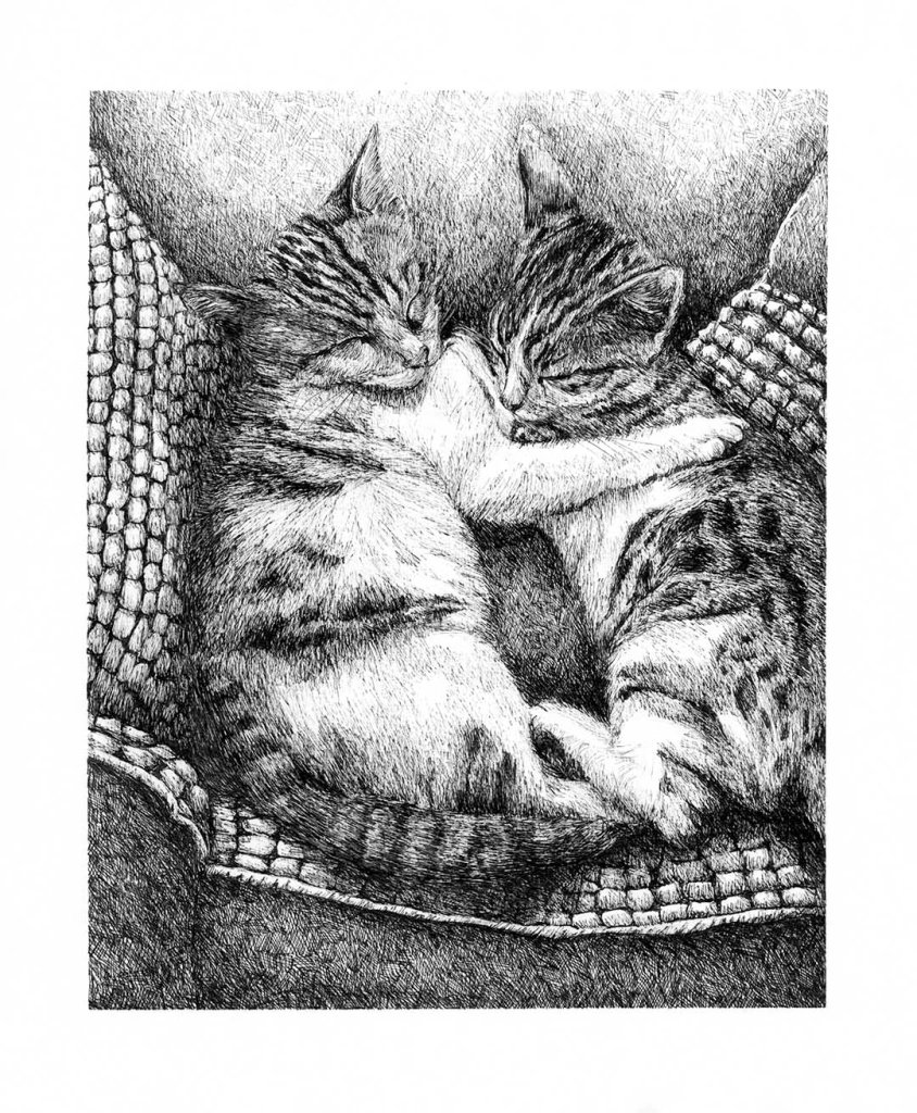
Inktober 52 had a prompt no. 26, called ‘Cuddle’ and I immediately saw a picture of my two cats, cuddling each other. They are sisters that groom each other, sleep together, play together and even give each other space to finish their food. I had so many lovely pictures of these two cuties:
I took up the challenge although I knew that this inking process will take a lot of time and ink to complete. For years I struggled to make peace with the fact that I get caught up in detail. I have tried many courses to loosen up my style, but with no success. My children (teenagers) call my art style ‘no-life’ art, because of the hours that go into it due to the detail or shading. But lately, I have decided that by embracing it and not working against it, my art is better than before and the method of repetition of the detail is extremely relaxing. The art making process becomes a meditation process. By working against my natural tendency towards detail and realism, art creates stress and deprives me of the joy it should give in the first place.
I usually work with A4 200 gsm Fabriano paper and a 0.03 Unipin Fineliner. I have a series of Unipins with worn tips at different degrees. The worn tips give me more options to work towards lighter shading without harsh marks.
This challenge was a first in a long time where I focused on detail like the fur of the cats and the patterns. I loved the process and I think the love for my two cats showed in the final artwork. Inktober also listed it as their favorite on Instagram.
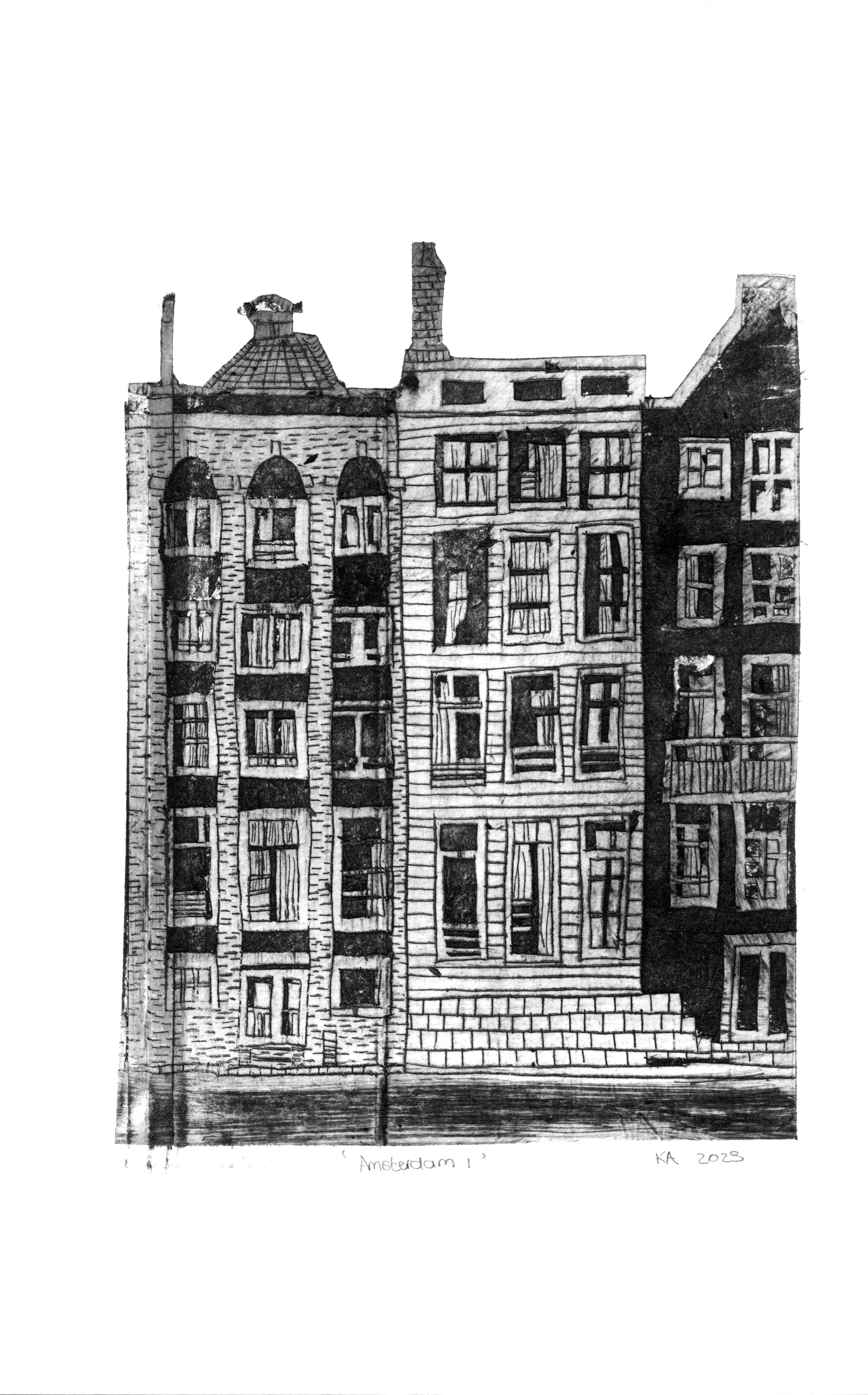
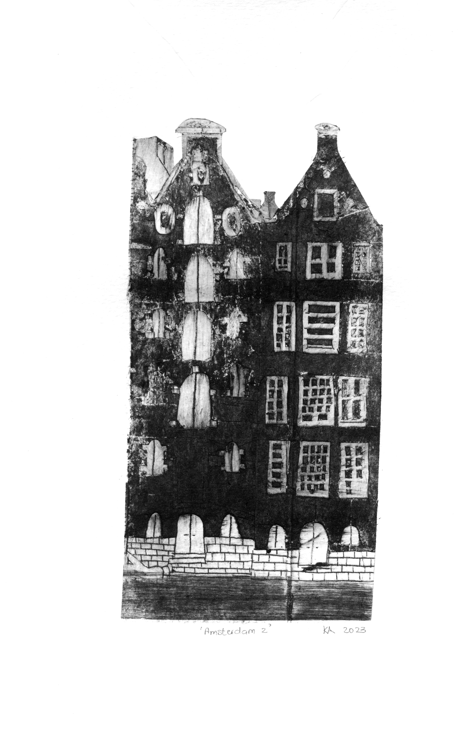
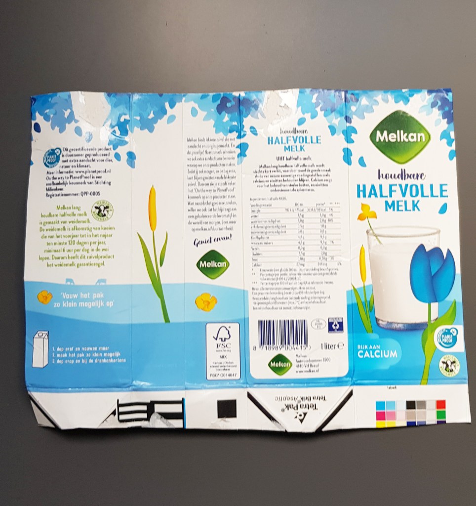
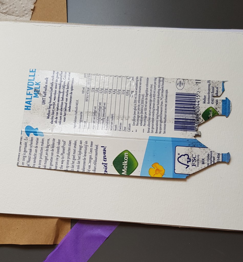
As with my previous tutorial on printing with plastic containers and a pasta machine, drypoint printing can also be done with milk cartons. It is also an exciting printing process and good for the environment.
It basically works the same way as with the plastic. Grooves are made into the silver foil of the milk cartons and the ink, when rubbed across the surface, stays in the grooves while the rest is wiped away. Once again, if you do not have an etching press, the pasta machine works just as well as the press.
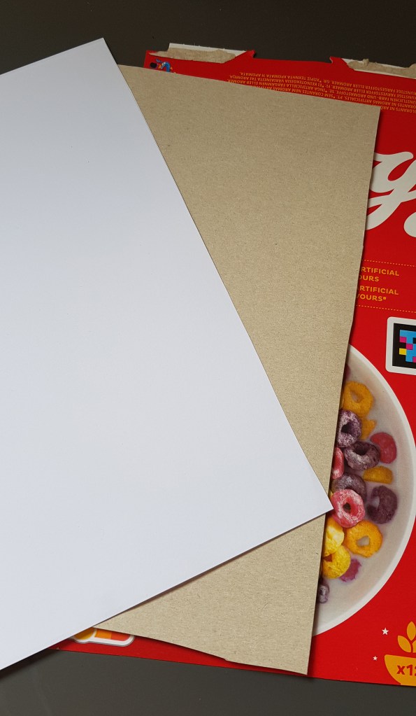
What you need:
Sketch/photograph
Milk carton with foil lining
Washi tape or sensitive masking tape: too strong masking tape might tear the surface of your sketch paper or image
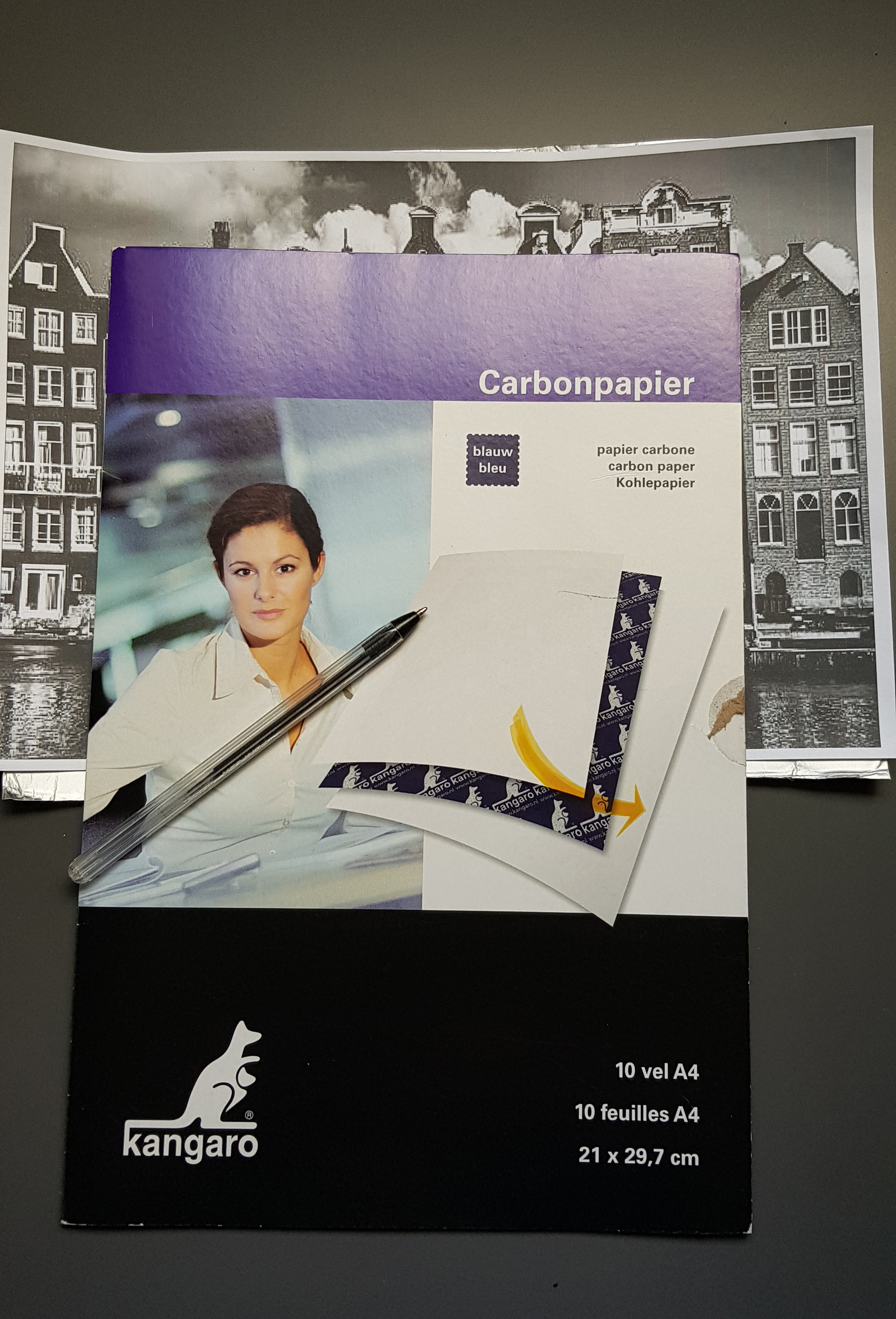
Carbon transfer paper (optional)
Etching tool or craft knife
Watercolor paper
Rectangular bowl with water
Plastic gloves
Etching ink e.g. Intaglio ink works the best
Soft cotton fabric like cheese cloth
Kitchen towel
A few cotton swabs
Paper (it can be printing paper or unprinted newspaper)
Cardboard from cereal box
Pasta machine, mounted firmly on a table
Method:
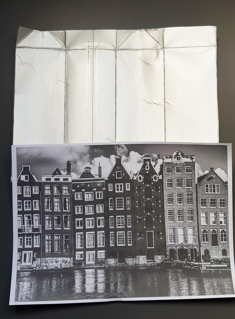
Make a sketch on paper or in your sketchbook or use a picture or photograph. REMEMBER: your image is going to print as a mirror image. If you use text, keep that in mind.
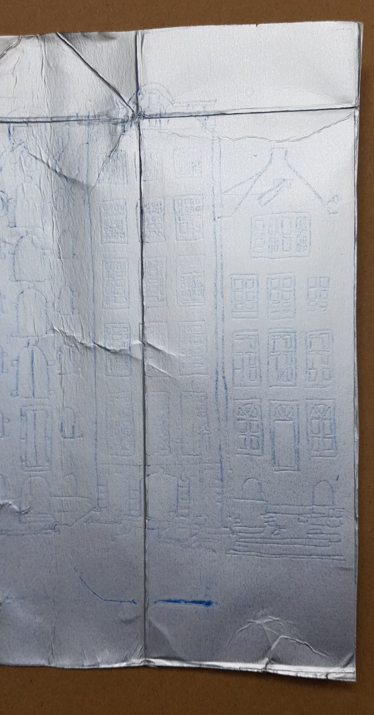
2. Cut the milk carton open and clean the inside. Cut it to the size of the print you want to do. You may use the smooth surfaces only, but keep in mind that the creased surfaces make interesting textures to your print. If you do not have carbon paper, you will still be able to see the image. The carbon paper makes it a bit clearer.
3. Place the image or sketch on top of the carbon paper on top of the carton and keep it in place by using the tape.
4. With a pen, trace along the drawing lines or lines of the image. Remove the image and carbon paper, but keep your image alongside as reference to your shading.
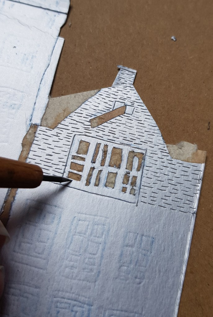
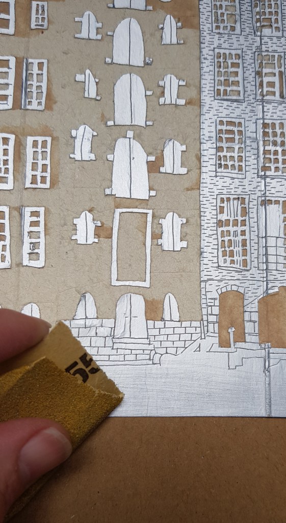
5. Use the etching tool or the sharp point of a craft knife and make engravings into the foil along your black sketch lines. If you want dark areas, make small hatch engravings. For pure black areas, the foil can be teared off. The areas that are not engraved are the light areas, the engraved areas will be darker and the cut-out areas will be the darkest. I have used sanding paper for the water areas to add a finer texture.
6. Cut the watercolor paper the size or larger than engraved image and soak it for 20 minutes in a flat rectangular bowl of water.
7. Also cut two cardboard pieces and two paper pieces the size of the watercolor paper.
8. Put the plastic gloves on and put a dollop or two of the ink onto the carton plate.
9. With circular movements rub the ink with your finger into the grooves and cover the whole plate. You may also use an old bank card to swipe the ink over the carton plate.
10. With the cloth, rub all the excess ink from the plate. Lastly with light movements and kitchen towel, wipe off any excess ink so that the silver parts are more clear.
11. Use the cotton swabs and wipe small highlight areas.
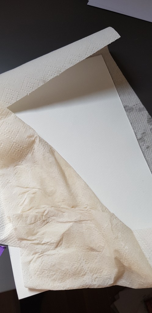
12. When you are happy with your plate, remove your gloves and wash your hands. You do not want any black fingerprints on your paper. I have decided to cut the image into 3 to make it easier for me to handle through the pasta machine.
13. Remove the watercolor paper from the water and tap dry with kitchen towel. When you hold the paper against the light, there should be no shiny parts.
14. Stack the pieces as follows: a piece of cardboard, then a piece of paper on top of the cardboard, next the watercolor paper, then the plate – face down onto the watercolor paper, again a piece of paper and lastly a piece of cardboard.
15.Grip it firmly and feed it into the pasta machine while rolling it evenly through the machine.
16.Remove all the pieces and enjoy your first piece of art!!!!